
Inner Compass
A warm, intelligent learning system for deeper self-awareness.
Project overview
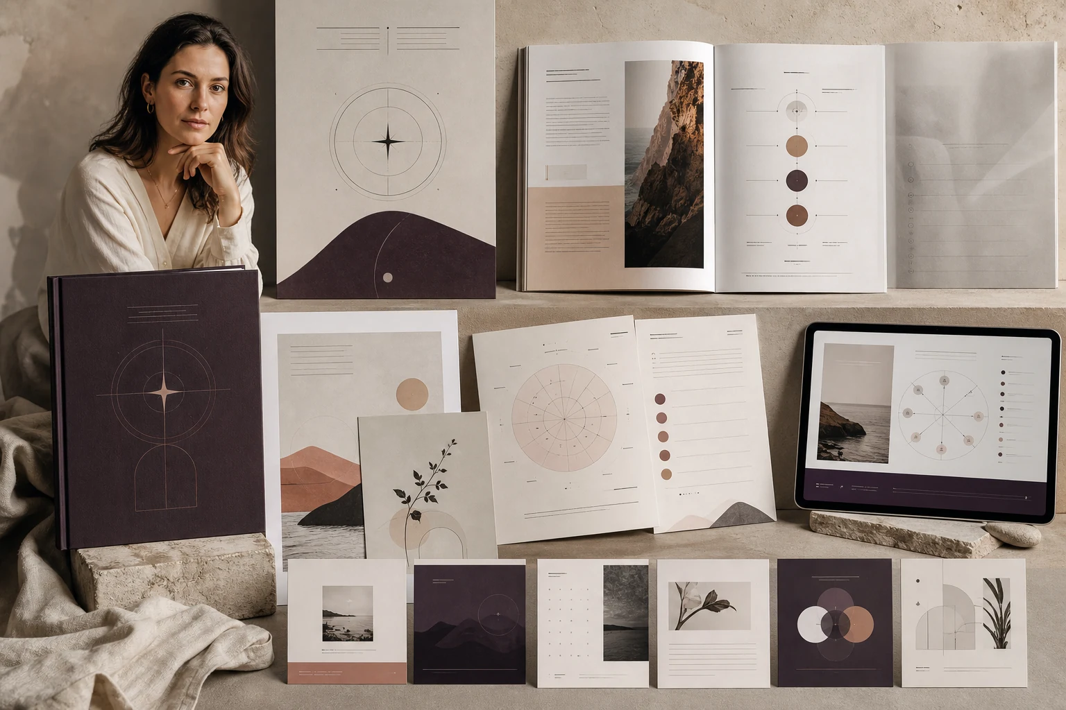
Created for an independent psychologist, Inner Compass turns a reflective eight-week programme into a tactile learning experience that feels private, spacious and carefully held.
The challenge
Sensitive subjects, journal prompts and practical models had to coexist without making the material feel clinical or overly decorative.
Visual direction
Mineral neutrals, aubergine and clay support editorial portraiture, fine diagrams and generous writing space. The result feels calm without becoming anonymous.
The system
A visual rhythm of reflection, theory and action connects the workbook, emotion maps, lesson decks and launch campaign.
Context
An eight-week psychology programme in which design must earn trust quietly.
Inner Compass brings together psychoeducation, observation, emotion mapping and reflective practice. Much of the work happens in private, away from the lesson, so the materials could feel neither clinical nor performatively emotional. They needed to hold sensitive subjects with calmness, give each exercise room to breathe and still provide enough structure for the participant to feel supported rather than left alone.
The psychologist supplied the complete eight-module programme, copy, journal prompts, exercises and practical models. We did not reshape the content or its sequence. Our work was to distinguish those layers visually, build navigation and create a considered rhythm of dense and spacious pages that supports the logic already established by the author.
Visual direction
A visual language with a clear point of view.
Editorial serif
+ precise grotesk
Creative premise
An inner compass does not prescribe the answer; it helps a person notice direction.
The compass became a metaphor for orientation rather than control. Fine axes, circles, scales and directional marks appear within emotion maps and transitions, but never harden into a logo stamped across every page. They suggest that psychological work is not linear: the same question may be revisited and understood differently as the programme progresses.
The visual world needed warmth without sweetness. Editorial portraiture, tactile surfaces and mineral colour replace generic images of happiness. This allows the course to address vulnerability without becoming childish or sentimental. The materials feel valuable enough for a premium programme, yet remain close, humane and appropriate for a person opening the workbook on their own.
Visual system
Mineral neutrals and precise typography create calm without anonymity.
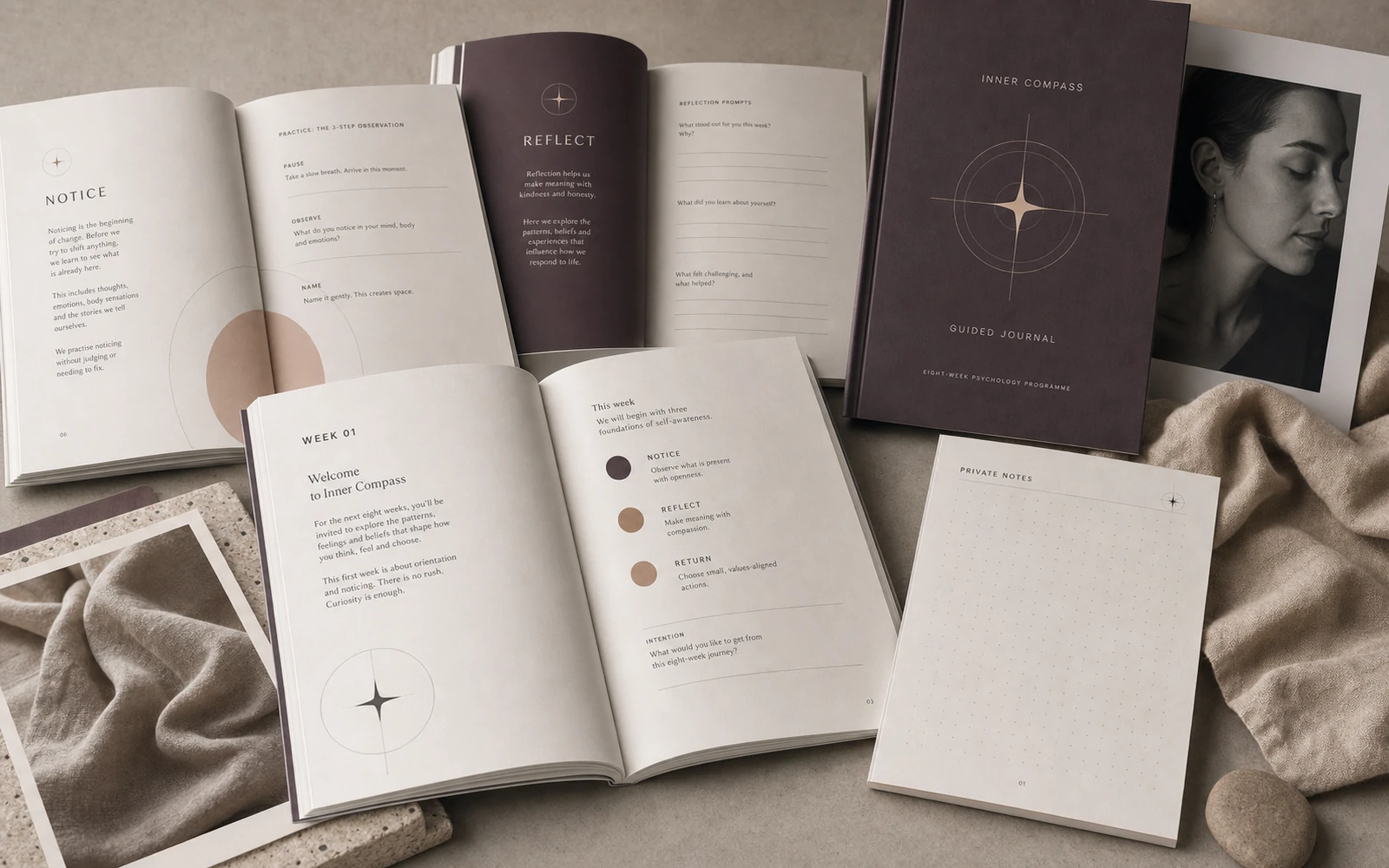
Warm neutrals, aubergine and clay provide depth without assigning a “correct” emotional mood. An editorial serif carries major questions and transitions; a clean grotesk handles theory, instructions and navigation. Fine rules and small markers maintain order without making the workbook resemble a clinical intake form.
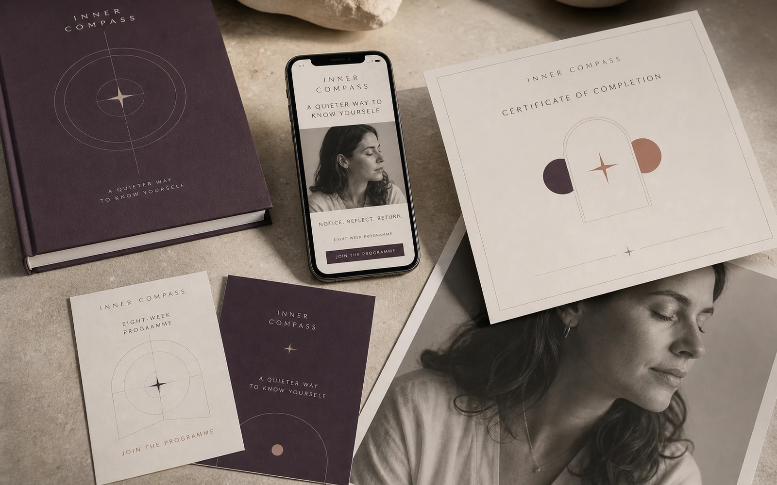
Photography works as a pause between content blocks: portrait details, gestures, fabric, stone and light bring a sense of the body back into the page. Illustrations and diagrams stay deliberately restrained so they do not interpret an experience on the participant’s behalf. The same visual system moves through the workbook, lesson decks, Stories and certificate.
Visual organisation of the materials
Theory, mapping and journalling each receive a distinct visual role.
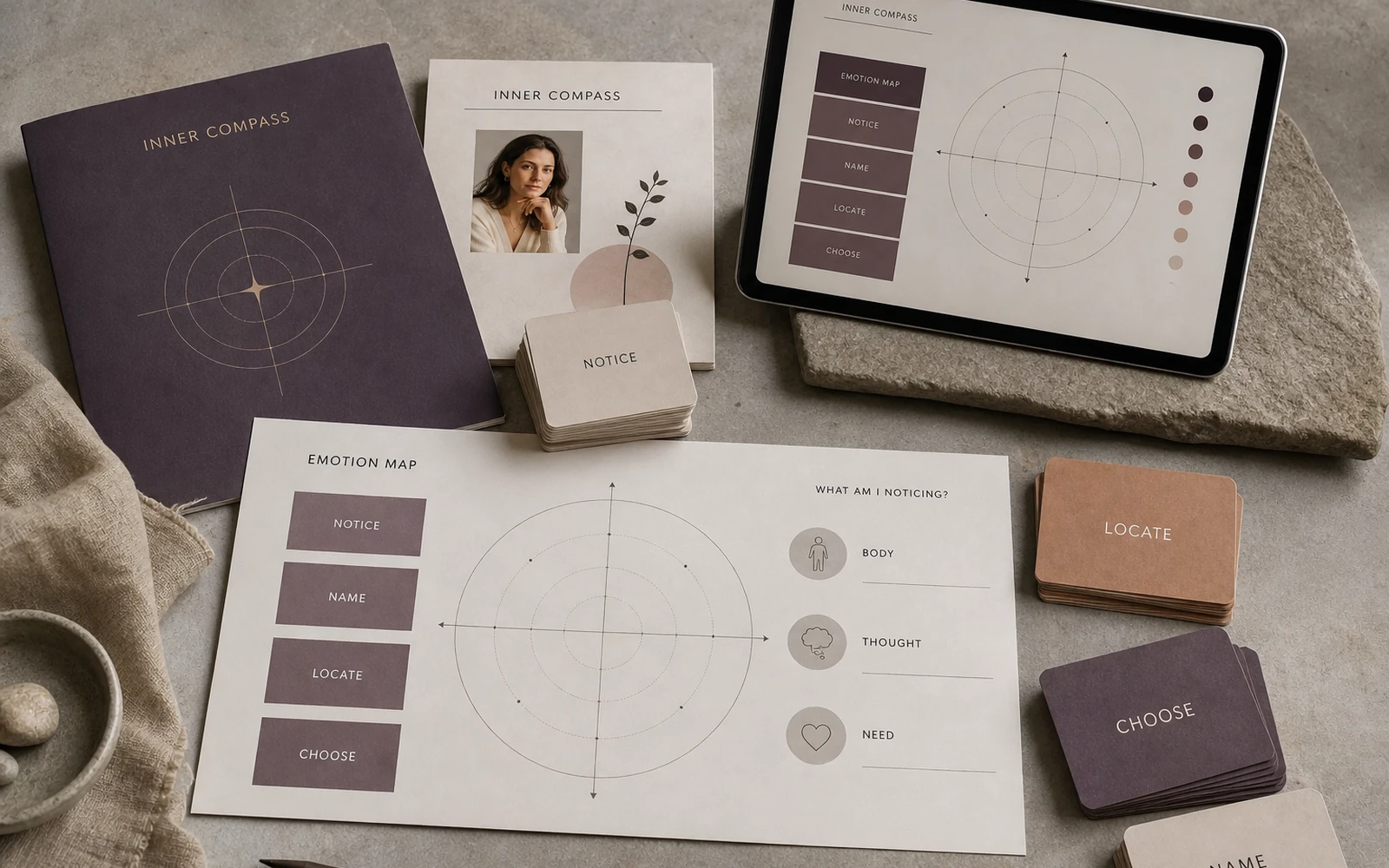
The approved module structure follows the psychologist’s sequence of orientation, explanation, model, observation, writing and closing support. We gave each existing content type its own format. Dense explanations are clearly separated from private notes, while reflection pages feel like space for thought rather than administrative forms. The hierarchy tells the participant what kind of attention the next page asks for.
The author’s emotion-mapping tools were given a consistent family of scales, coordinates and state cards. We did not create the psychological model; we made its existing logic visible and practical to complete. Guided journal pages use quieter prompts and more writing room. All of the tools belong visually to the lessons while remaining useful as standalone resources.
Understand
Apply
Learning experience
The page feels gentle, while every action remains clear.
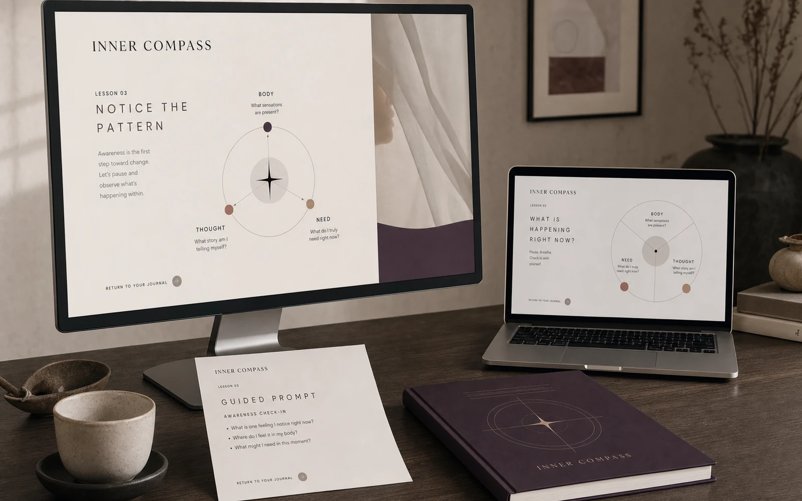
In psychology education, delicacy can easily become vagueness. Inner Compass leaves room for a personal answer while clearly signalling whether the participant is being asked to read, notice, mark, describe or return later. Icons, labels and page rhythm reduce organisational effort so attention can stay with the reflective work itself.
The lesson presentation system supports the psychologist’s voice rather than duplicating the workbook. Definitions, maps and questions remain visible during explanation; fuller writing happens on the corresponding page. Certificates and completion materials continue the same quiet language, marking progress without introducing a sudden layer of ceremonial decoration.
Launch system
The communication invites thoughtful work rather than promising instant transformation.
The launch campaign is built around precise observations and questions in which the audience may recognise themselves. Stories alternate short educational ideas, fragments of maps and visual pauses. Instead of dramatic before-and-after claims, the campaign reveals the actual character of the programme: patient attention, structured tools and a qualified practitioner present alongside the process.
Shared margins, portrait direction, circular geometry and the aubergine accent connect ads, lesson covers and certificates. Each format can hold a different emotional intensity without becoming a different brand. The prospective participant sees an honest version of the experience before enrolling, and the first module confirms what the launch has promised.
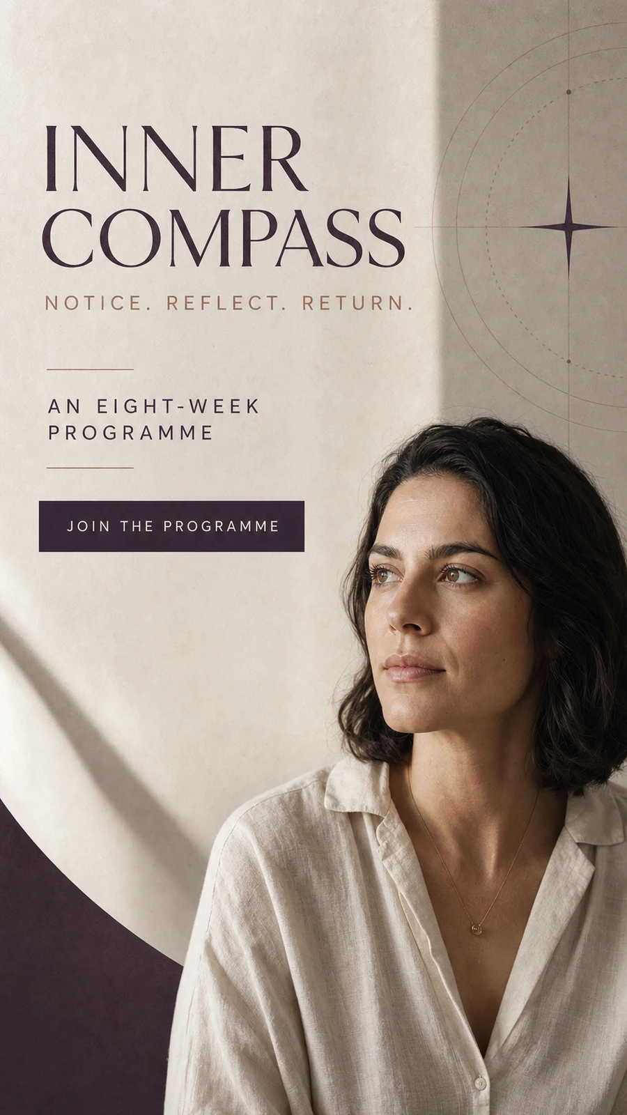 Story 9:16
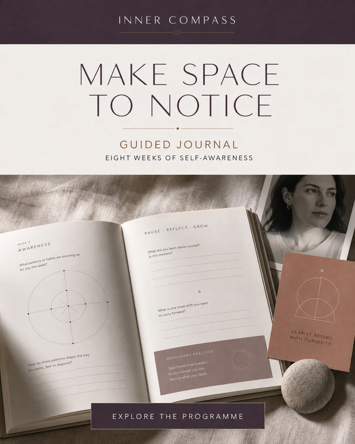 Social 4:5
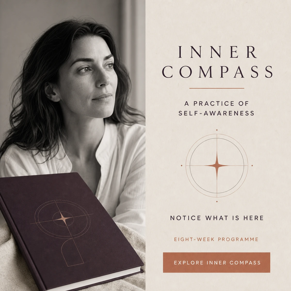 Campaign 1:1
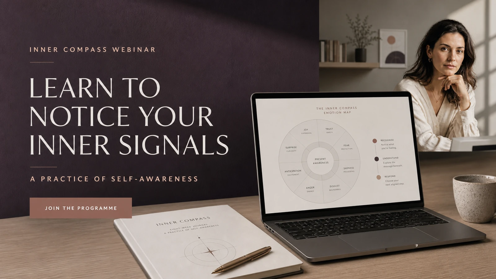 Webinar 16:9
System deliverables
8-module workbook
Emotion mapping tools
Guided journal pages
Lesson presentation system
Student certificates
Launch campaign and Stories
What the system enables
Inner Compass holds sensitive material in a consistent and recognisable form.
An eight-module workbook, emotion maps, guided journal pages, lesson presentations, certificates and the launch campaign now work as one system. Every item has a distinct function: a map helps name an experience, a journal page creates space, a slide holds shared attention and a Story introduces the approach.
The visual language can accommodate additional practices and future themes without altering the programme’s character. It already contains clear treatments for explanation, observation, mapping, writing and completion. That gives the psychologist a dependable design framework and gives participants confidence through clarity, care and repeated attention to detail.