
Journal · Design notes
Ideas for better learning products.
Practical writing on editorial design, visual hierarchy, learning materials and cohesive course launches.
New pieces will be added over time.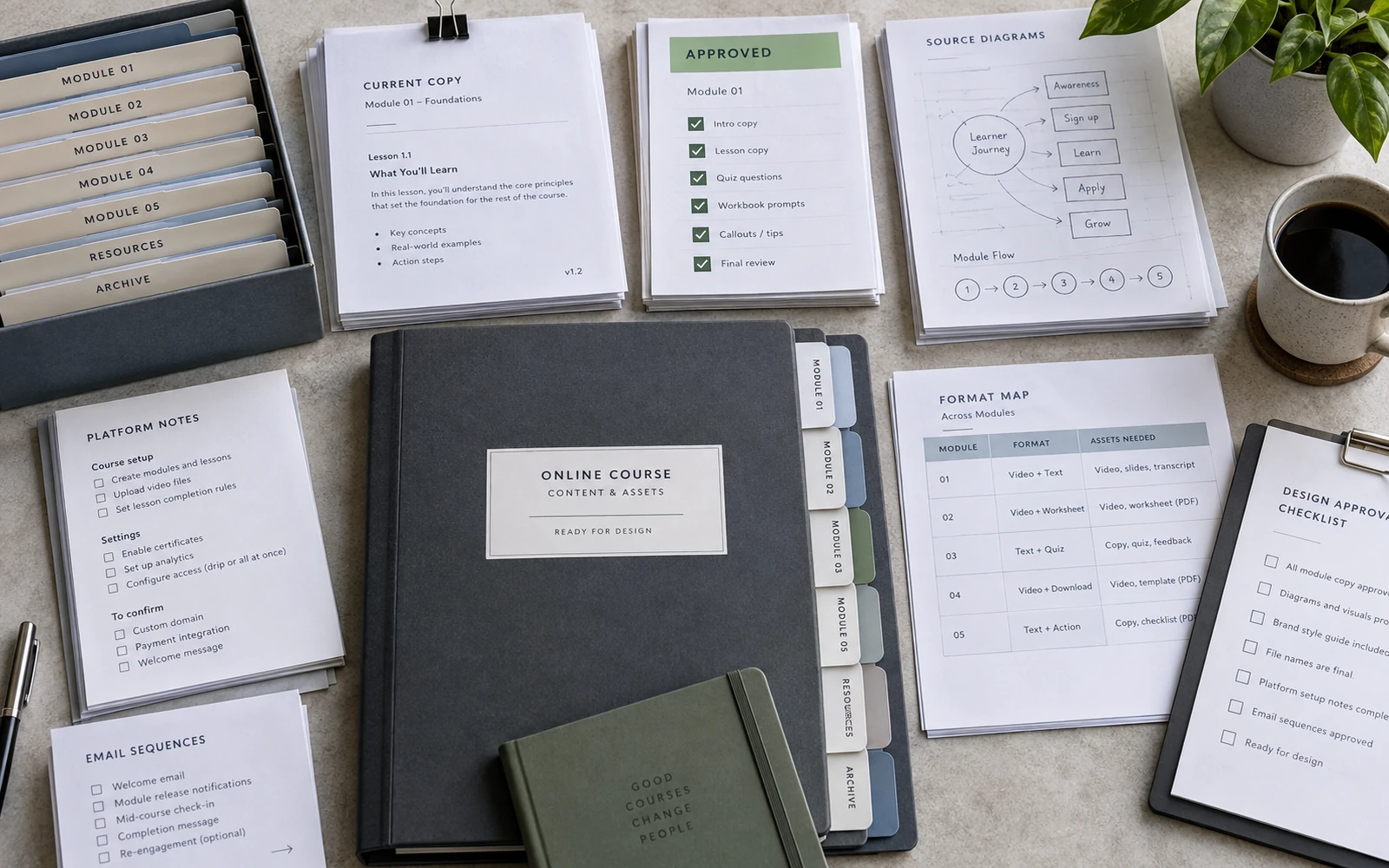
How to Prepare Your Online Course Content for Design
A practical content handoff checklist for course creators: what to finalise, organise and label before a workbook, slide deck and launch system enter design.
Read article ↗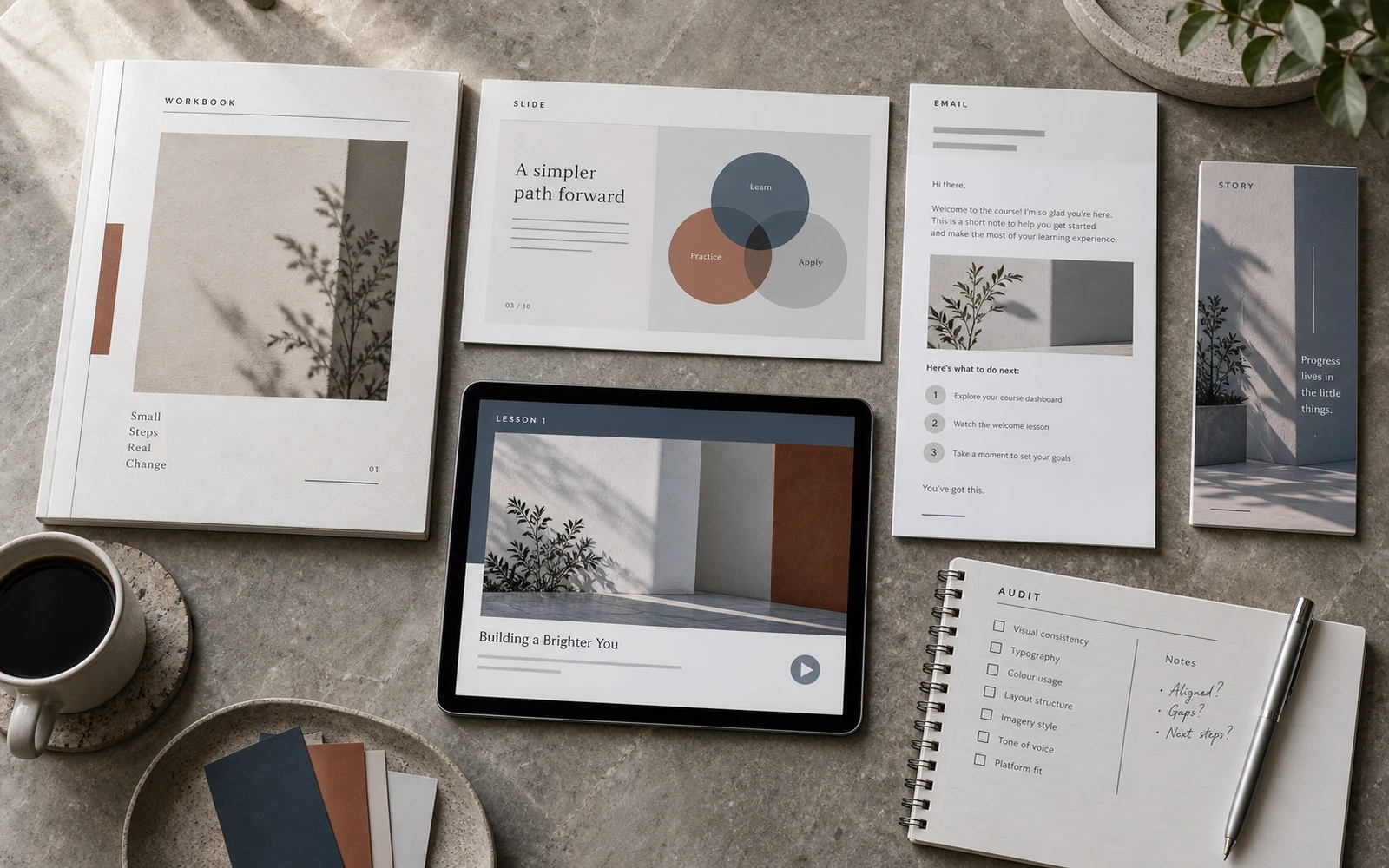
12 Signs Your Course Has Materials, but No Visual System
A visual audit for online courses: twelve signs that workbooks, slides, emails and launch assets look acceptable alone but fail to work as one product.
Read article ↗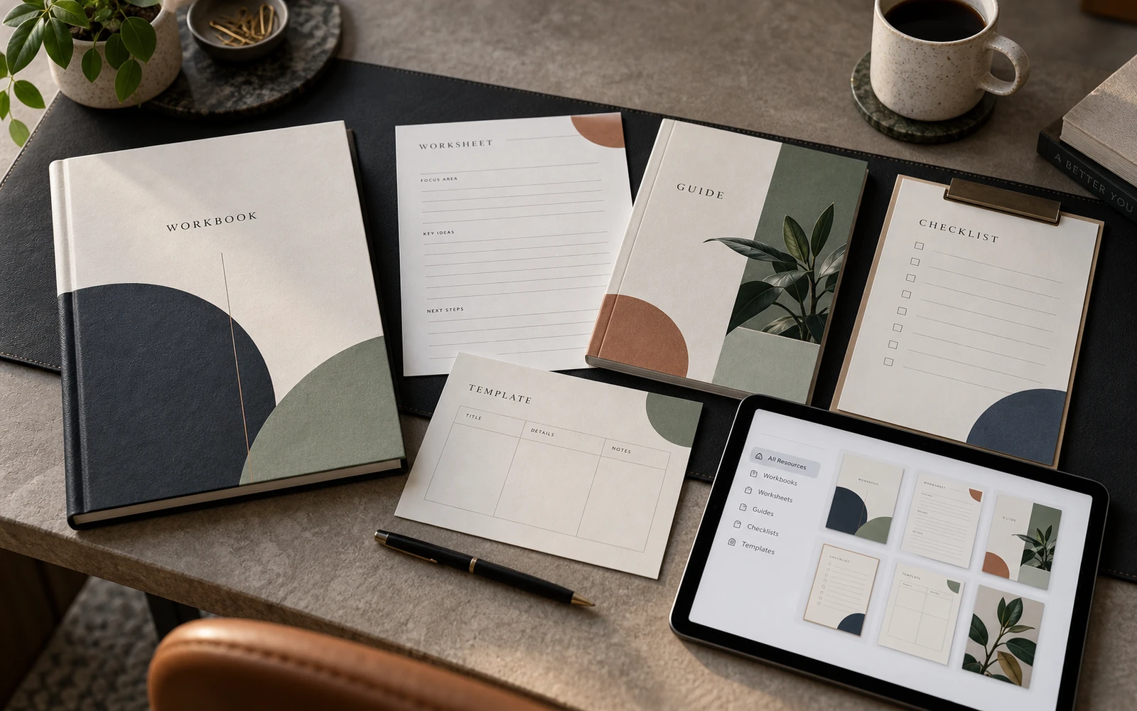
Workbook, Worksheet or Guide? Choosing the Right Course Format
Not every piece of course content belongs in a long PDF. Learn when to use a workbook, worksheet, guide, checklist or template—and how they work together.
Read article ↗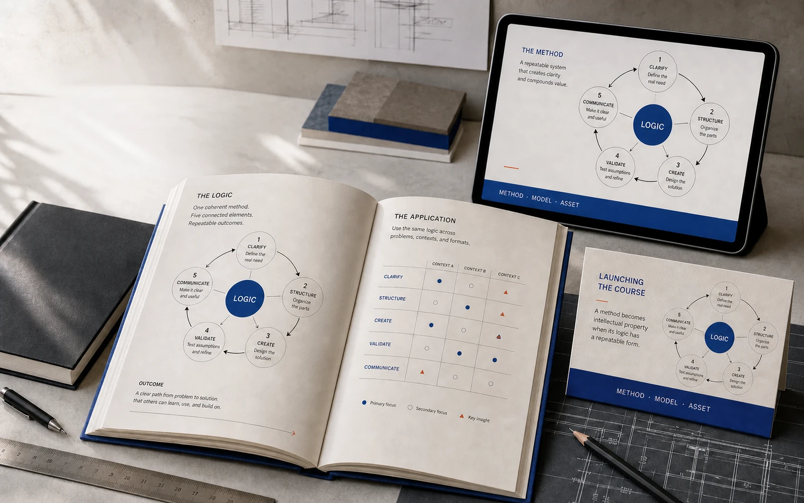
How Branded Diagrams Turn Expert Knowledge into Intellectual Property
A framework becomes more memorable when its logic is visible. Explore how custom diagrams, models and maps can give expert knowledge a recognisable form.
Read article ↗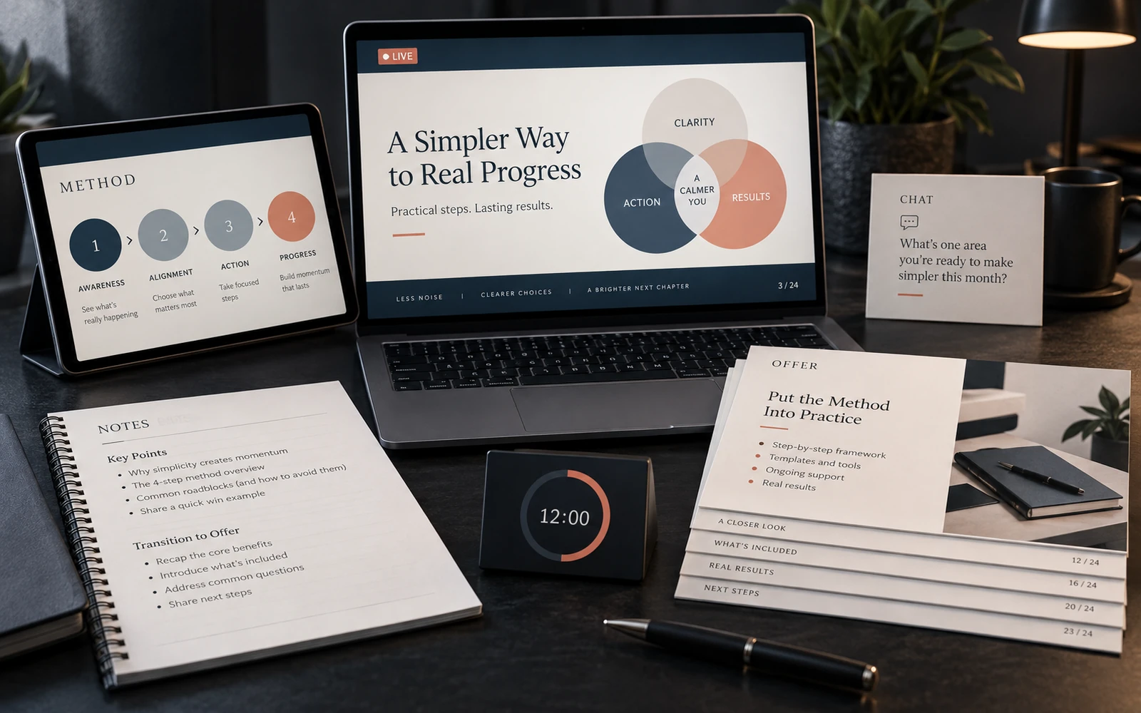
How to Design a Webinar Presentation That Teaches and Sells
A premium webinar deck must support the speaker, clarify the method and prepare the offer without becoming a wall of text or an endless sales pitch.
Read article ↗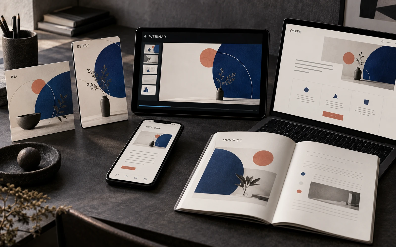
Course Launch Design: One Visual System from Ad to First Lesson
How to connect paid ads, stories, a webinar, sales-page graphics and learning materials so the launch feels like an introduction to the product itself.
Read article ↗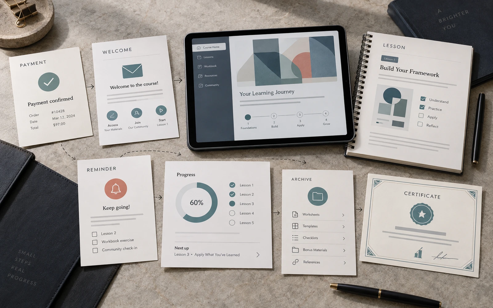
The Student Journey: 15 Course Touchpoints Worth Designing
The learning experience begins before lesson one. A map of the small visual touchpoints—from payment confirmation to certificate—that make a course feel considered.
Read article ↗
Why Your Course Needs a Visual System — Not Just a Workbook
A workbook is only one touchpoint. Discover how a coherent visual system connects learning materials, presentations and launch assets into a more valuable course experience.
Read article ↗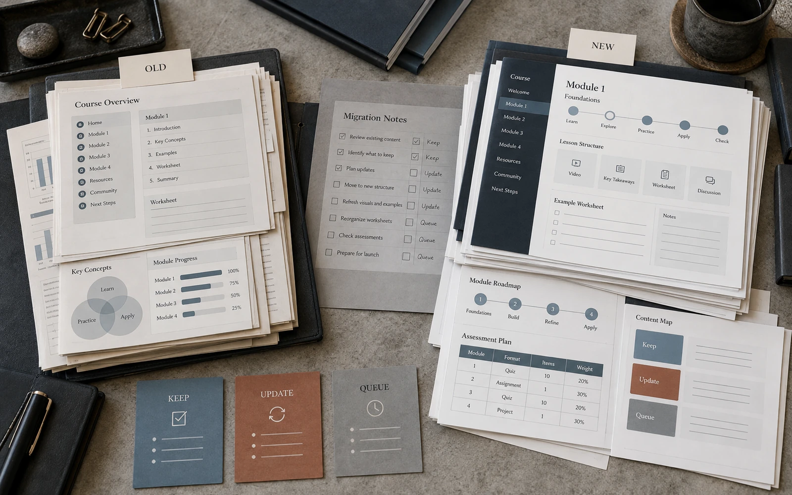
How to Redesign an Existing Online Course Without Starting Over
A staged approach to improving an established course: preserve what works, fix the visual system and relaunch with stronger materials without rebuilding everything.
Read article ↗