A workbook can be beautifully made and still look cheaper than the knowledge it holds. This is not because the designer did not try hard enough. One successful PDF cannot hold an entire product. A course lives in slides, in stories, in a webinar, in advertising, on a sales page, and in the emails before a cohort opens. When those touchpoints speak different visual languages, the student and the buyer do not read a system. They read a set of separate materials.
A premium impression does not come from a cover. It appears when a person meets the same level of attention, the same hierarchy, and the same character several times in a row. That is what a visual system does: it turns expert content into an educational product, not a folder of files.
A course rarely lives in a single PDF
Most experts begin with a workbook, and there is logic in that. The texts already exist. The module structure is more or less clear. What is needed is a format in which the student can read theory, complete exercises, and return to the key models. A workbook can genuinely become the heart of a course. But a heart does not replace a body.
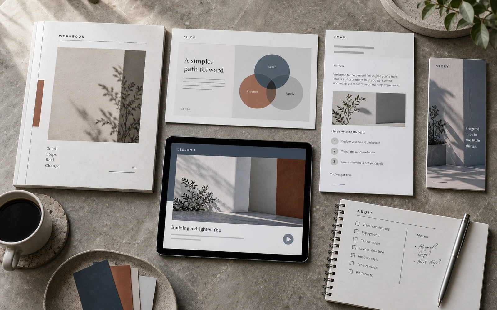
Look at how a person actually moves through a programme. They see an announcement in the feed. Open stories. Register for a webinar. Watch a presentation. Buy. Receive an email. Open the first lesson. Read a guide. Fill in a worksheet. Review the slides. Screenshot a diagram. Later they see a certificate, and a few more creatives from the next launch. In all of these places the course either looks like one brand, or like a different studio every time.
When the workbook is made in one aesthetic, the slides in another, and the advertising assembled from templates of a third style, the product comes apart. The knowledge may be strong. The price may be high. But the eye registers the break faster than the mind can excuse it with content. That is why a course with expensive thinking so often looks like a pile of Google Docs, Canva files, and accidental banners.

What a course visual system is
A visual system is not “one colour for everything”, and not a logo placed in the corner of every slide. It is a set of decisions that repeat precisely enough for a person to recognise the product even without the name on the cover.
A system of this kind usually includes:
- the character of the type: which serif or sans-serif carries the headings, how dense body text sits, how captions and metadata are marked;
- a modular grid: margins, columns, the rhythm of the page, room for diagrams, quotations and exercises;
- information hierarchy: what the student sees first, what is secondary, how theory, example and action are separated;
- a visual language for diagrams: how models, tables, audience maps, funnels and scales look;
- rules for launch formats: posts, stories, banners, advertising, webinar covers;
- the tone of photography or illustration: not “any stock”, but a limited, recognisable world of images.
When these layers are in place, the workbook stops being a separate artefact. It becomes part of a larger language. A slide no longer competes with a PDF page. A launch creative no longer looks as if it was made for another brand. The student spends less attention on “where am I now”, and more on the material itself.
This is the difference between educational design and the styling of a document. A document can be made tidy. A product has to survive the move between formats, screens, densities of content, and the states a person passes through: from the first encounter in an ad to the tenth page of an exercise.
Why a beautiful workbook will not save the launch
A single strong format creates an illusion of completeness. The expert sees an open spread, a considered cover, careful margins — and it seems the course is already designed. Then the launch begins, and it turns out there is no related presentation for the webinar, no system of frames for stories, and the ad layouts are assembled at night from whatever looks vaguely similar.
At that moment the workbook works against the product. It sets an expectation the rest of the materials do not confirm. Someone who saw a premium cover meets, two days later, a banner with a different typeface, a different grid, and a different temperature. Trust does not necessarily disappear. It simply never has time to form.
There is another effect, an internal one. The team, or the expert working alone, starts inventing solutions from scratch every time. Each new module, each lead magnet, each series of stories becomes a separate mini-project. That is expensive, slow, and almost always less precise than a system assembled at the beginning.
So the question is not whether the workbook is worth making. It is. The question is whether it is the first expression of a language that can later scale — or a unique object after which everything else has to be pulled into line.
One language for learning and selling
An educational product has two audiences at once. The first is the student, who needs to orient, understand, remember and apply. The second is the buyer, who still needs to feel the level, the clarity and the seriousness of the offer before the first lesson. A visual system works for both.
For learning, the system gives rhythm. Theory looks like theory. An exercise looks like a field for action, not another paragraph. A diagram is not a random picture, but part of the same logic as the text around it. When the student moves from workbook to slides, they do not learn a new interface. They recognise the structure.
For selling, the system gives a sense of coherence. The launch stops being a separate campaign. It looks like a natural continuation of the course itself. This matters for programmes priced from a few hundred to several thousand dollars: the person is buying not only access to lessons, but the impression that the product already exists as a whole.
A course should look as valuable as the knowledge inside it. But that value does not rest on a single spread. It is held by repetition.
Repetition here does not mean sameness. The system leaves room for accents: a dense theory page, an airy reflection page, a dark slide with a model, a light frame for stories. The tension changes. The character does not.

What the system is made of
Not every course needs everything at once. But it helps to see the map, so the work is not designed at random.
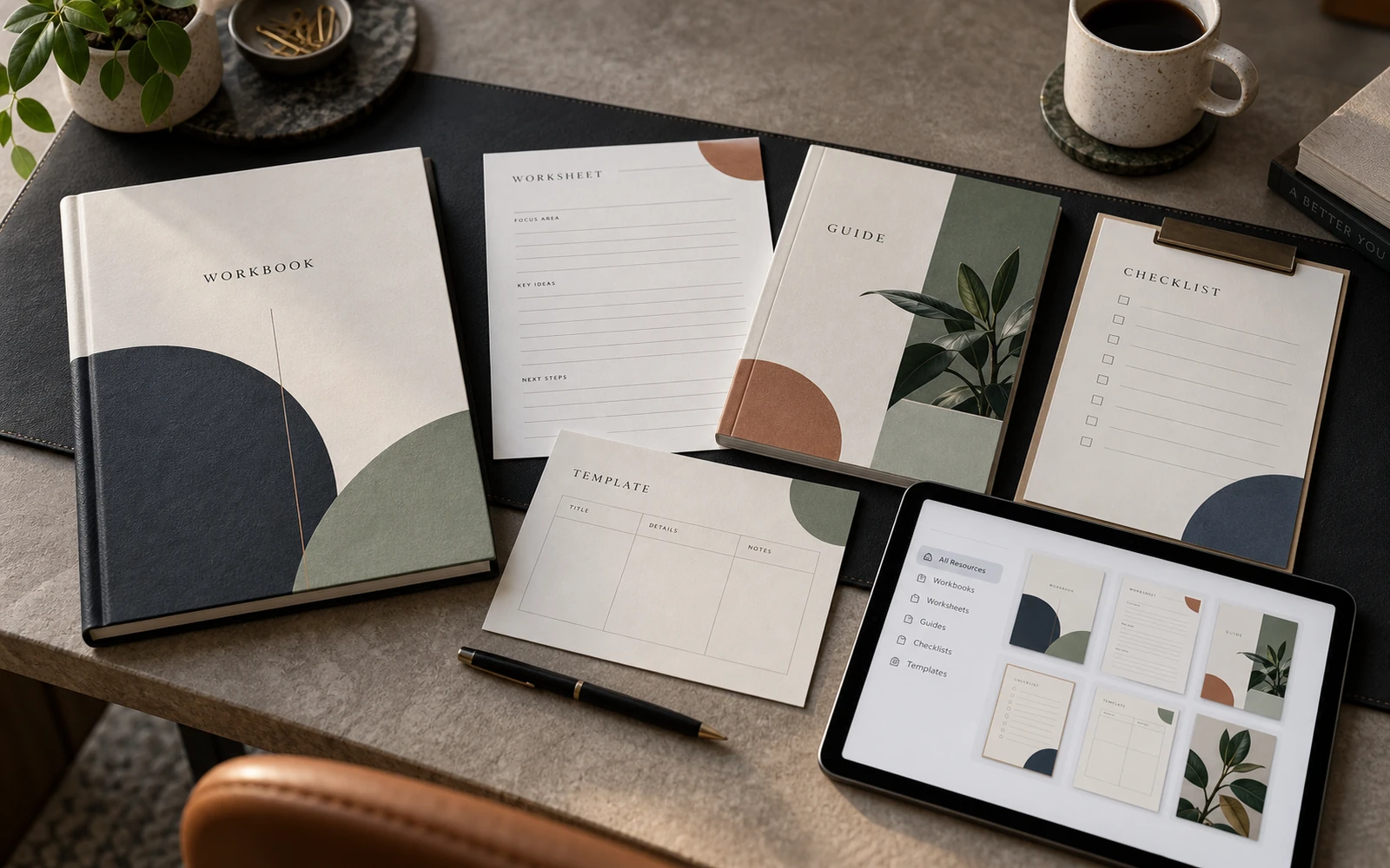
The learning core. Workbook, worksheets, checklists, guides, resources for the student. Here the priority is the readability of dense text, navigation, space for writing, room for definitions and takeaways. If this layer is weak, the rest of the system rests on decoration.
Explanation. Lesson slides, the webinar presentation, module covers, standalone graphics for complex ideas. What matters here is not the beauty of a slide, but the ability to lift the essential from a workbook page without losing hierarchy.
Models. Original diagrams, comparison tables, process maps, frameworks. These often become the face of the expertise. If diagrams are drawn differently every time, the expertise looks less coherent than it is.
Launch. Social posts, stories, banners, advertising concepts, the look of the sales page, sometimes short motion layouts. This layer should not shout louder than the product. It should be a recognisable continuation of the learning language.
After the start. Certificates, community materials, module updates, new lead magnets. A system is valuable not only in the first launch. It lowers the cost of the next ones.
When these layers are designed together, the expert stops hiring separately “someone for the PDF”, “someone for stories” and “someone for banners”. One logic appears, which can then be developed.
How a system changes the perception of price
People rarely put this into words, but they read price with their eyes. If a $1,000 product looks like a $29 template, friction appears. Not necessarily fatal. But enough for someone to hesitate longer, compare cheaper offers, or wait for one more free live session.
A visual system does not replace content, an email sequence or a pre-launch. It removes the visual dissonance between the claimed value and what the person actually sees. In this sense, design is part of the learning experience and part of the commercial gesture at the same time.
There is a practical consequence for the expert. When the materials are gathered into a system, it is easier to sell the next cohort, add a module, make a new lead magnet, without starting the brand from zero. A system is an asset. A single beautiful file is an expense.
That is why comparing design “per page” is almost always the wrong measure. A page without a system is cheap only at first glance. Then it has to be translated into slides, stories, advertising and the next product. A system lays those translations in from the start.
Where to start if you only have content
You do not need a full ecosystem of 20 formats at once. But the work should begin with an audit, not with decoration.
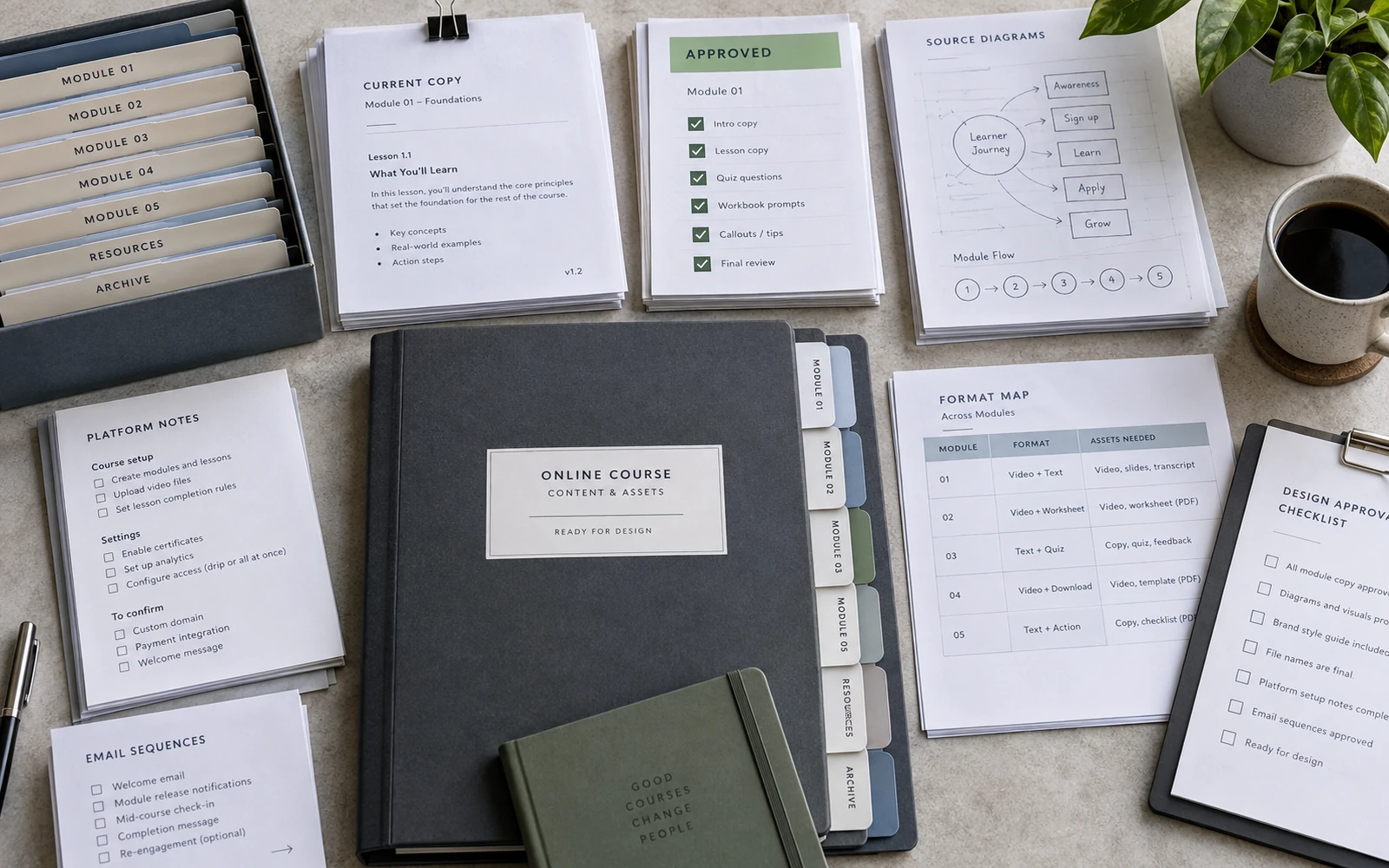
First, gather everything that already exists: texts, module structure, the current brand, references, a list of what the student and the buyer will actually see. Then decide which types of page are truly needed. Not so that it “looks nice”, but so that theory, example, exercise, diagram, conclusion and navigation are covered.
Next, the direction is fixed: typography, palette, the character of images, a few key spreads. Only after that does the system expand across the rest of the content. If you skip this step and immediately lay out 80 pages, you will have a great deal of styled material without a language you can repeat.
A useful rule: half of what is shown in a portfolio, and in an internal presentation to a client, should be dense. Not only the cover and an airy quotation spread, but a page with a lot of text, a table, a diagram, an exercise. That is where you test whether the system can work with real expertise.

What not to disguise as a system
A system does not appear because one accent colour has been placed on every file. It also does not appear from a large number of mockups. A mockup shows an object in space. It does not prove that inside there is hierarchy, navigation, and repeating page templates.
Do not confuse a system with universal graphic design of the “I will do everything” kind. A course has its own kinds of work: holding attention through long text, working with diagrams, fields for writing, the logic of a slide, adaptation for launch. If these tasks are not named, design slides into decoration.
And one more thing. A system does not replace content. If the course structure is raw, the texts are not approved, and the modules change every week, production will be more expensive and more fraught. Design can help order the material visually, but it does not write the programme in place of the expert. That is an honest boundary, and it is worth naming at the start.
How to know the system is working
There is a simple test. Open the workbook, three slides, two stories and one advertising layout. Remove the logo. If it is still clear that this is one product — the language is in place. If without the logo the materials fall into four styles, there is no system. There is a set of styled files.
A second test is more practical still. Try adding a new module. If that requires inventing new page types, new diagrams and new slide logic, the system was decoration. If you take already approved templates and fill them, the system works as infrastructure.
A third test concerns the launch. Can a run of creatives come from the same grid and typography as the learning materials, without becoming either a loud promo poster or a random banner? If so, the course begins to look like a brand, not a temporary campaign.
A product, not a document
A workbook remains the core of many programmes. It should be made carefully, densely, with respect for the text. But what is sold and designed should not be the typesetting of a PDF. It should be the visual layer of the entire educational product: from the learning materials to the launch campaign.
Then the client arrives not with the question “how much is a page”, but with another: can the course, the slides and the launch be assembled as one language. That is the right positioning. Not because it sounds more serious. Because that is how the product actually exists in the student’s life.
If you already have the content, the audience, and an understanding that the course should look at the level of your own expertise, the next step is not another cover. It is a system that will hold the learning, the launch, and the next cohort.
Discuss your course