
Journal · Design notes
Ideas for better learning products.
Practical writing on editorial design, visual hierarchy, learning materials and cohesive course launches.
New pieces will be added over time.
How to Build a Course Design Template Library That Actually Scales
A useful template library is more than a Canva folder. Learn which page, slide and campaign templates help a course team grow without losing quality.
Read article ↗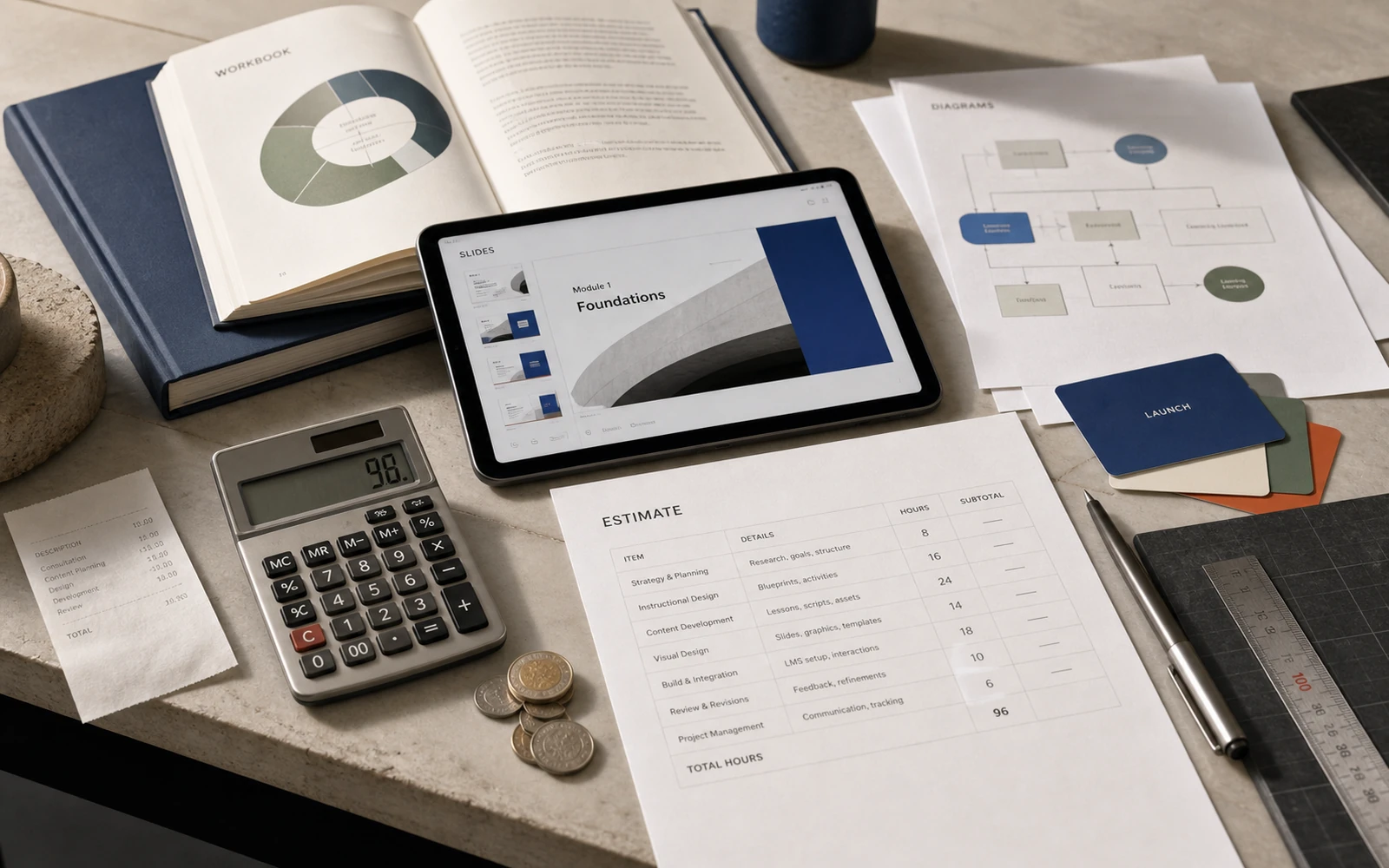
How Much Does Online Course Design Cost—and What Are You Paying For?
A clear guide to course design pricing: what shapes the budget for workbooks, slides, diagrams and launch assets, and why page count tells only part of the story.
Read article ↗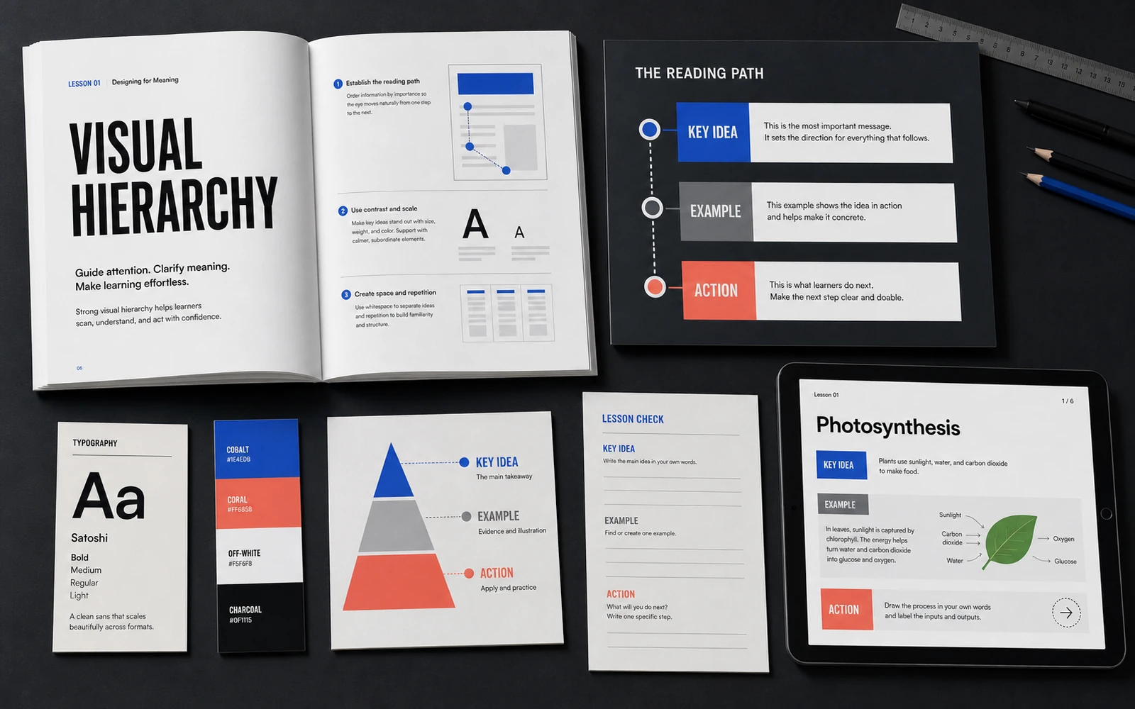
How Visual Hierarchy Makes Complex Content Easier to Learn
Typography, spacing and information rhythm are not decoration. They guide attention and help students understand dense expert content without losing context.
Read article ↗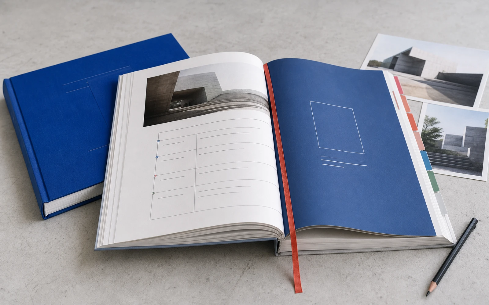
7 Pages Every Premium Course Workbook Should Include
Beyond the cover: seven practical page types that turn a PDF into a useful learning tool—from chapter navigation to reflection and action planning.
Read article ↗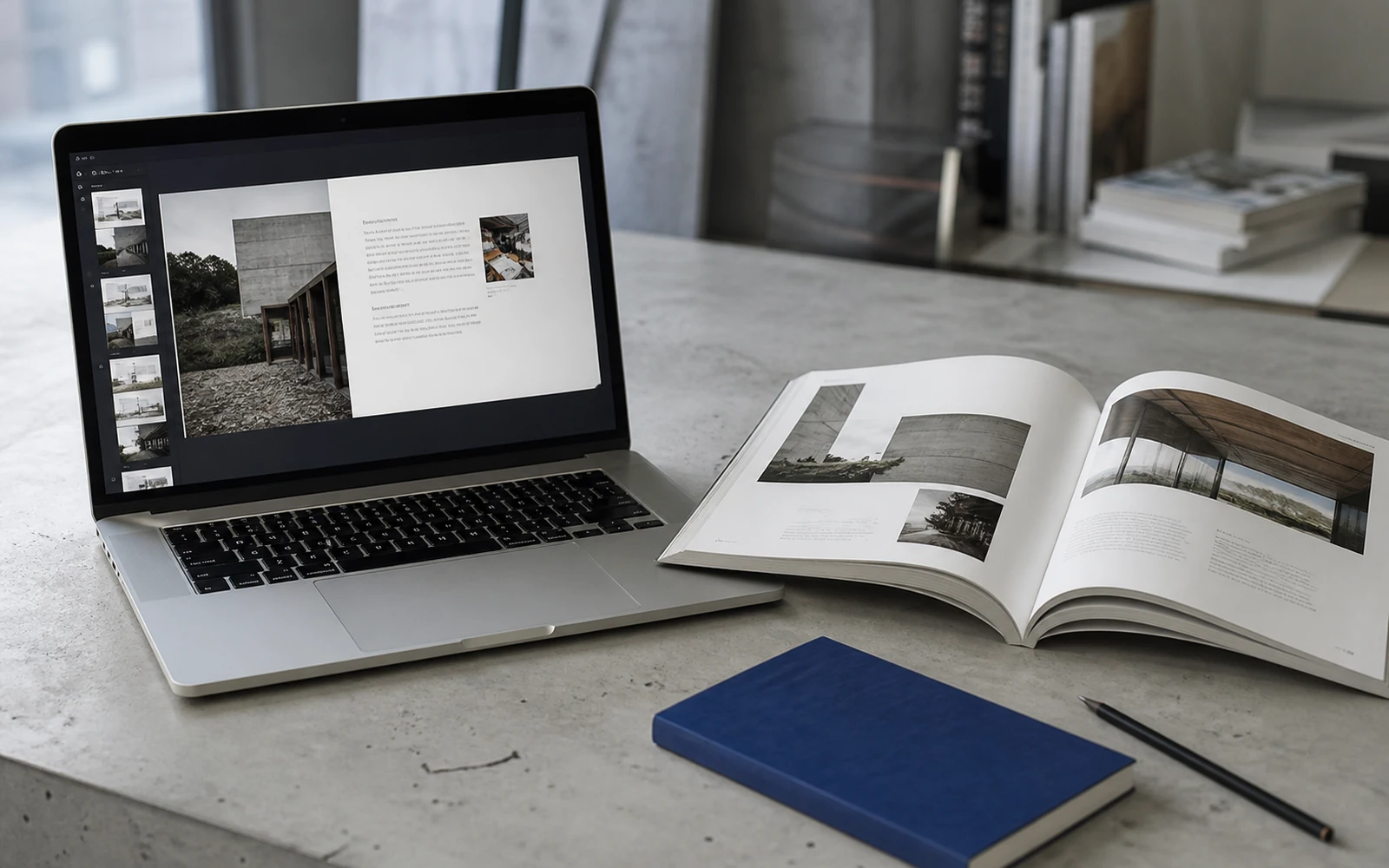
Why Course Slides and Workbooks Should Speak the Same Language
When slides and learning materials feel unrelated, the course loses coherence. A shared design system makes teaching clearer and the product more memorable.
Read article ↗
From Expert Content to a Cohesive Educational Product
A practical look at the design process: auditing raw content, defining hierarchy, creating templates and extending the system into a complete launch.
Read article ↗
What Actually Makes an Online Course Feel Premium?
Premium is not a colour palette or an expensive mockup. It is the cumulative effect of clarity, consistency, pacing and thoughtful learner touchpoints.
Read article ↗