A premium workbook rarely fails because the cover is not beautiful enough. It fails when a student cannot tell where they are, what to read, where to write, or what to do after the module. The look can be quiet. The structure cannot be accidental: the file either supports learning, or it only accompanies learning with a look.
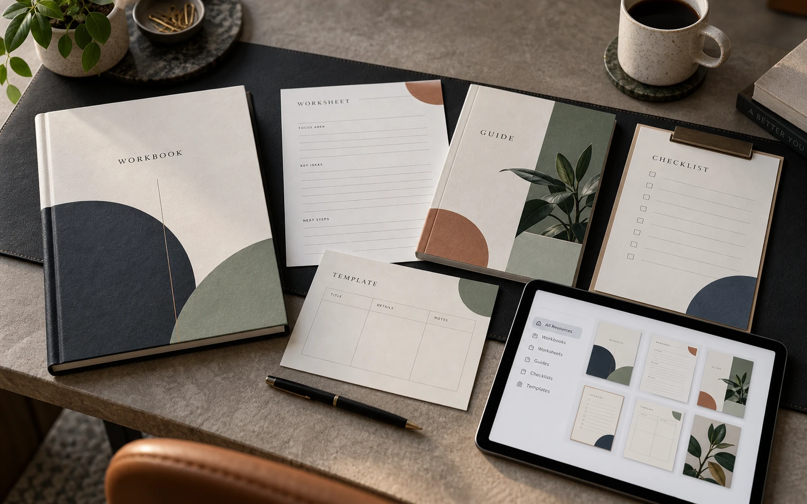
The seven page types below are not a catalog of techniques, and not a checklist for looking substantial. They are working formats that create a rhythm: orientation, explanation, density, model, action, comparison, transfer into practice. Miss any of them, and the PDF remains a tidy document. Assemble them as a system, and the workbook becomes a tool people return to.
Rhythm matters more than page count
A ninety-page workbook with no change of mode tires a student as quickly as a short file in which every page looks the same. Each turn asks for the same attention: the same paragraph, the same card, the same accent. After twenty minutes, the sense of progress disappears. What remains is a scroll of text in careful margins.
Page types work as a shift in tension. Navigation gives a map. Theory holds one idea. Dense content carries the method. A diagram takes from the text what is better seen. A worksheet asks for the hand, not only the eye. A table helps someone choose. Reflection closes the cycle. When these formats alternate, a person is not reading a PDF. They are moving through a route.
This also reduces chaos in production. Instead of inventing a new spread for every topic, you design seven templates and fill them. A new module is not a new design. It is new content in a language already understood.
Cover and navigation
The cover gathers expectation: the name of the program, the author, the duration, who this level is for. Its job is not to hook. It is to name the product with precision. The map should follow at once. A contents page that mirrors the course structure and shows page ranges — not a decorative list with tiny numbers. Mark where the worksheets sit. Then the student looks for a specific sheet after the lesson, not for “something to write on.”
A module divider is navigation too, not a poster. Keep a stable place for the week number, the lesson title, two or three learning outcomes in verbs — “map the roles,” “choose a criterion,” “write a seven-day plan” — and a short time estimate. A large quotation on a divider spread earns its place once. If every module opens on mood, the map disappears. Atmosphere remains.
Small navigation holds the whole file. A running header with the module name. A page number that matches the contents. Where it helps, a quiet label for the type of page: theory, diagram, exercise. Students often open the workbook not from page one, but from the place they stopped after a lesson. Without landmarks there, they search with their eyes instead of working.

Theory page
Theory in a workbook is not a lecture transcript, and not a slide stretched onto a sheet. It is a page that holds one idea: what this is, why the student needs it, where it works, where it breaks. Leave room for a key term, a short example, and the limit of use. Do not pack five concepts onto one spread to save paper.
The practical frame is almost always the same. The heading names a concept, not a mood. Then a paragraph of context, a definition, two or three points on how this looks in work, one caveat. If the idea is new to the audience, leave a field for “in your own words.” Not as decoration: so the student makes a first restatement while the theory is still warm.
Theory should look like theory. A different type size, a different density, a different character of margins than the exercise. Otherwise the change of mode disappears: reading and writing merge, and a blank is turned the same way as an explanation. Premium here is not air around a quotation. It is that the concept takes exactly the space it needs, and does not disguise itself as inspiration.
Dense content page
This is where you find out whether the workbook can hold expertise, or only looks convincing in a mockup. A method rarely fits three short bullets. There are protocols, sequences, exceptions, wordings that cannot be shortened without loss. A dense page has to carry them: a hierarchy of headings, paragraphs of a usable length, numbered steps, sometimes a narrow column for the instructor’s note.
The usual mistake is to stretch the method across many airy pages so the file feels more substantial. The student then turns and loses the thread. The other is to dump everything into a solid block with no levels, as if it were an appendix to the lesson rather than part of the learning. Both take from the design the responsibility for reading.
Make the dense page on purpose. Give it its own template: a wider text column, space for if / then, marked exceptions, subheads every few paragraphs so someone can return to a step, not to “the middle of the text.” This is not less design. It is design that respects the material. If a system cannot hold density, it can only dress covers.
A premium workbook is not the one you want to photograph. It is the one you return to in week three, because there is a place to orient, something to apply, and somewhere to write the decision.
Diagram and framework
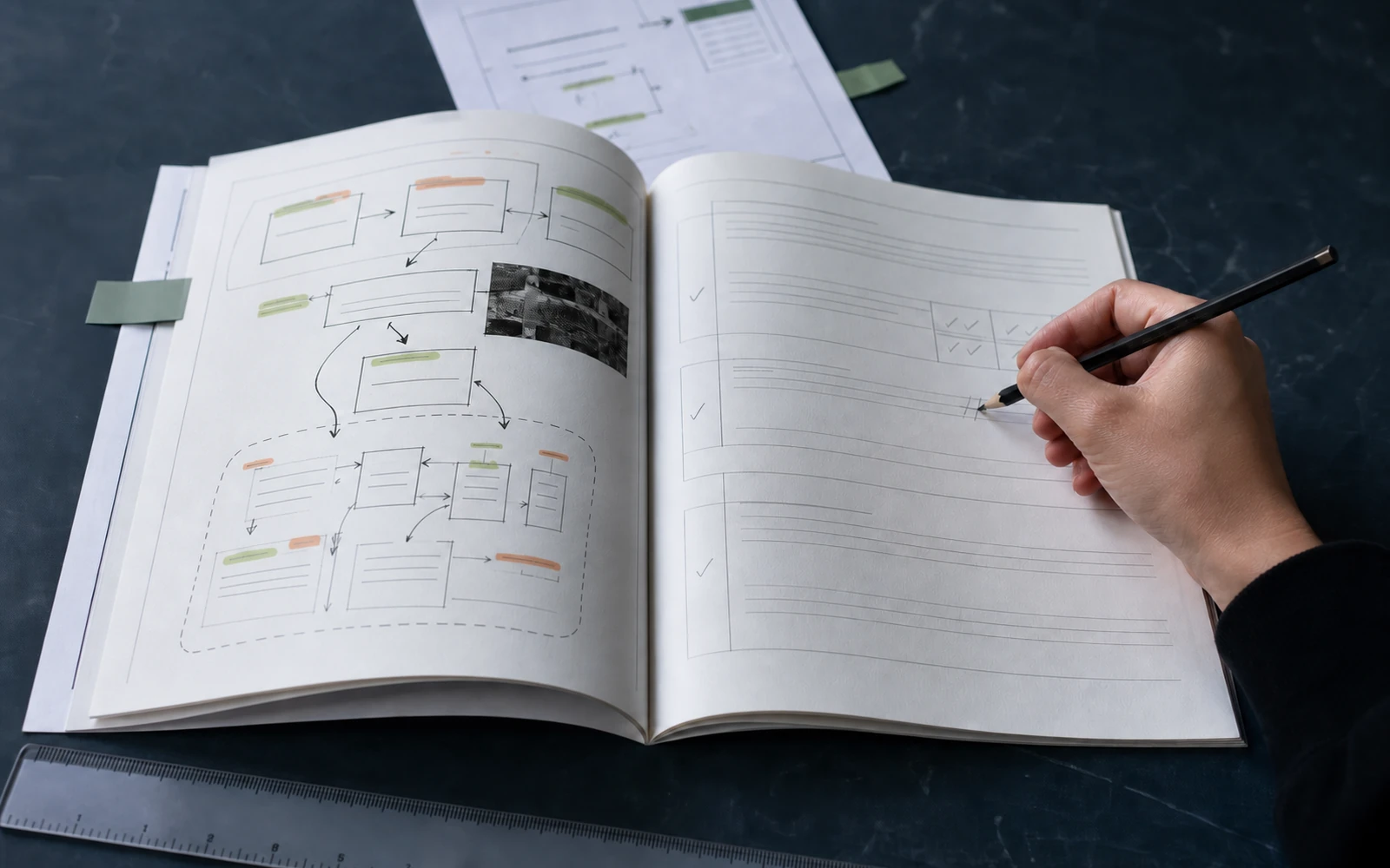
A diagram in a learning product is not an illustration to break up the text. It is a model the student has to remember and use: stages of a process, axes of a decision, a map of roles, a cycle, a matrix. It needs a name, numbering that matches the text beside it, and a short note on where to start reading. If the diagram cannot be understood without a long paragraph underneath, it is not yet ready as a page.
A dedicated spread for the framework makes sense when the model is the heart of the module. Then the same form should reappear, reduced, on the worksheet: the exercise refers to a structure already known, not to a new picture. That repetition is what makes the diagram a tool, not a one-off graphic.
Do not let the visual outrun the thought. The number of arrows is not the depth of the method. Premium here is in the precision of labels: what is a stage, what is a principle, what is an example. Icons without text names almost always steal clarity. Keep the same line weight, the same character of labels, and the same logic of start → fork → result throughout the course.
Worksheet and exercise
The exercise is where the workbook stops being for reading. The fields have to be real: enough line height, a clear number of steps, a prompt someone can answer. “Think about your experience” is a weak task. “Describe the last project where the team stalled at alignment. What did you do in the first forty-eight hours?” is a working one.
Useful details that are often skipped. A sample filled line in a lighter size. A limit: three points, not an essay. A mark for whether the sheet is completed during the lesson or after. If the student prints the file, the lines cannot be decorative. Empty space is part of the pedagogy, not an unfinished layout.
One exercise, one task. When situation analysis, option generation, and a month-long plan share a page, a person finishes none of them. Three short worksheets in a row are better than one overloaded sheet. If the exercise rests on a framework, put a miniature of the model at the edge of the page. The student should not have to flip back only to remember the axes.
Comparison and table
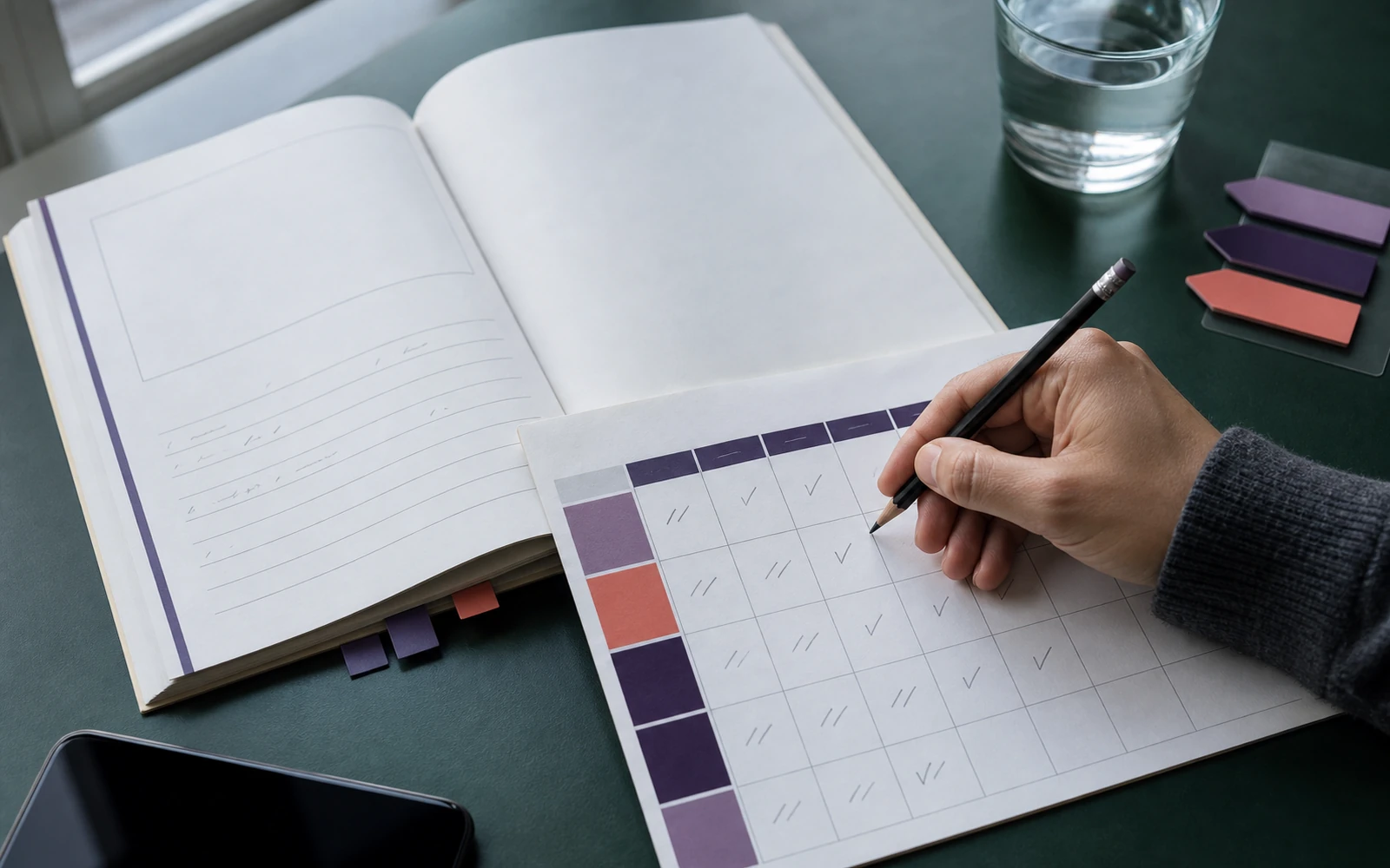
A table belongs where a decision depends on criteria: approach against approach, before / after, types of request, levels of skill, what to do yourself and what to hand to the team. This is a thinking page, not an imitation of a report. Above the table, put the question it answers. Without that, a grid of cells looks like an internal document that wandered into the learning.
A learning table is not an accounting table. Fewer columns than you want — four is already the limit for handwriting. Headings in human language, not the jargon of an internal team. Enough cell height if someone has to write their own example. An empty row for the student is often more valuable than another one filled by the author: that is where transfer happens.
Comparison removes false universality. The expert shows in which conditions the method works, and in which it does not. The student stops hunting for a single right answer and starts choosing. If the table is only a handsome block in the middle of the text, it is not doing this work. Return the content to a dense page. Do not perform structure.
Reflection and action plan
A module with no path into practice remains consumption. The reflection page gathers what was actually taken in: which idea changed a decision, where resistance appeared, what is still unclear. The action-plan page turns that into a step: what to do this week, with whom, by which date, how to know that something moved. These are two different modes. Do not merge them into one blurred summary.
Questions should be bound to the content of the module, not to general well-being. After a framework: which quadrant describes your current project. After a table: which criterion will you choose next time, and why. After a dense protocol: which step will you skip if you are in a hurry, and what will you put in its place. The universal “what did you take away” quickly becomes a formality.
An action plan has to fit real life. Three lines with a deadline are more useful than a manifesto across a spread. Space for an obstacle and a short “if X happens, I will do Y” often saves the intention better than a motivational paragraph. If implementation or a launch follows the learning, this page becomes a bridge: not a poster of completion, but a protocol of first steps.
Leave a date to return. A workbook in which reflection lives only in the moment of the lesson grows weaker. A page you can come back to a week later, and add what worked, turns the file into a working notebook — not a souvenir of the course.
Seven types are a language, not a showcase
Not every module needs all seven pages. A short lesson may have no table. A methodological block will have more dense pages than dividers. The system works when the types are named, look different, and assemble into a predictable sequence: map, explanation, method, model, sheet, choice, action.
Check the file this way. Close the contents and turn the pages. Is it clear without reading where theory is, where the exercise is, where the diagram is? If every page looks like the cover, you have dressed a document. If the types can be read at arm’s length, you have assembled a tool.
The second check is harder. Take one module and strike out everything without which the student would still get through the lesson with their eyes. If only navigation disappeared, the file is fragile. If the worksheets disappeared, learning remained something to look at. If the dense pages disappeared, atmosphere remained, without method.
A workbook is worth attention when it holds expertise in structure, and the student in action. Seven page types are not decoration around knowledge. They are the way knowledge becomes usable: it can be found, understood, compared, written down, and carried into the next week.
Discuss your course