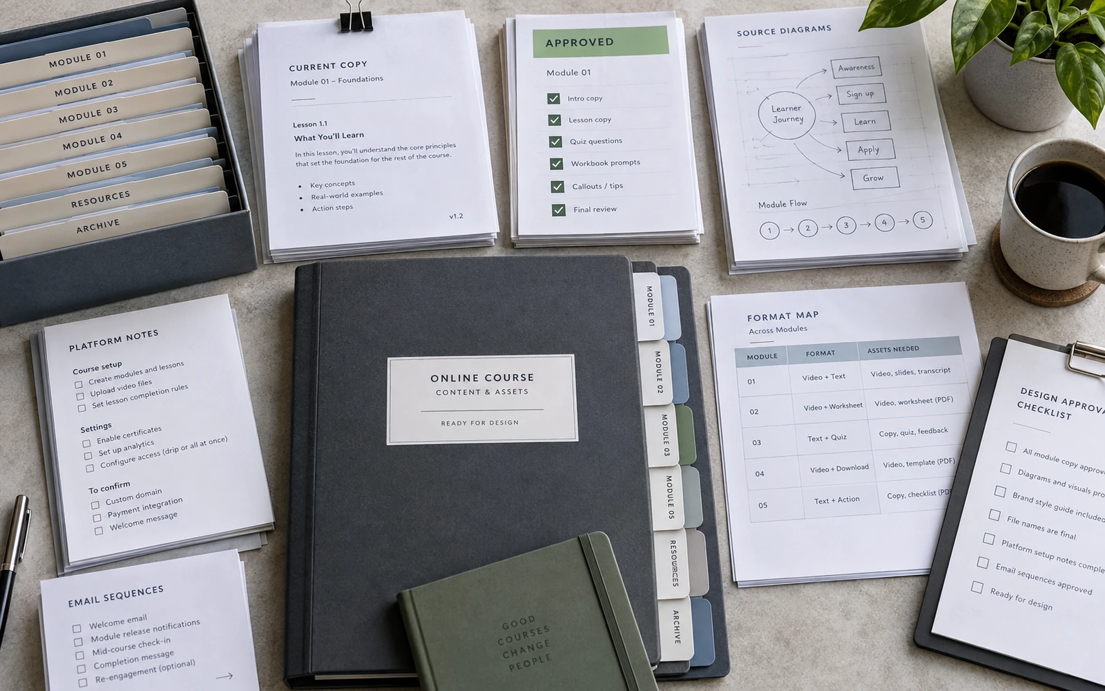
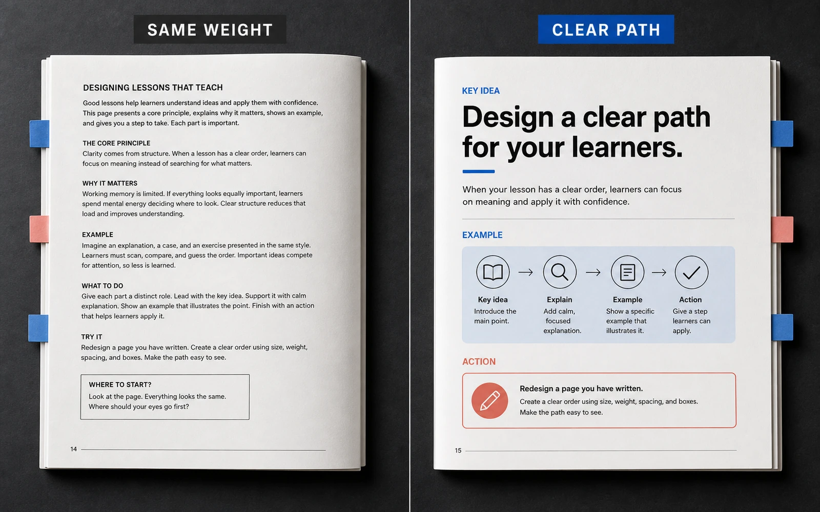
When every thought on the page carries the same weight, the student has to invent the structure. The author already sees the thesis, the example, the aside. The reader sees a flat field of text. They pause not on meaning, but on a more basic question: where to begin, and what can be skipped. In dense expert material that pause is costly. Attention goes to reconstructing order instead of understanding it.
Typography, spacing and information rhythm are not decoration. They steer the eye before the first sentence is fully read. Scale shows what matters. Contrast marks a foothold. Space gathers related ideas. Repetition removes the need to decode, each time, where theory ends and action begins. When these decisions hold together, a lesson becomes a path. When they do not, even strong material feels heavier than it is.
When the page does not hold the structure
An expert course is rarely light in substance. It holds models, exceptions, sequences, definitions, examples and tasks. That is as it should be. The problem begins when every layer looks the same: the same type size, the same weight, the same margins, paragraph after paragraph.
The student then does the work design should have done. They hunt for a heading. They guess where the thesis ends and the explanation begins. They cannot tell whether a highlighted sentence is a rule or simply an author’s emphasis. In a workbook this becomes a wall of text. On a slide, a set of equally loud lines. In a worksheet, a form that never says what to do now.
The page can still look tidy. Even margins, quiet type, nothing that juts. But tidiness without hierarchy is silence that is hard to navigate. Learning does not need decorative restraint. It needs guided attention. When everything looks equally important, everything starts to feel equally unimportant. The student scrolls. They are not lazy. They were never given a way in.
Hierarchy is the order of reading
Visual hierarchy in learning is not “make the heading larger.” It is a decision about the order in which a student meets ideas, and how much attention each one deserves. A well-built page answers three questions before the first paragraph: where am I, what matters here, what happens next.
Four tools hold that order: scale, contrast, spacing, repetition. They work together. A large heading with no space around it will not save a page. A contrast accent that lands in a new place every time will not create rhythm. Repetition without a difference in roles becomes monotony.
Hierarchy belongs in the structure of the lesson, not as ornament applied after layout. If the material holds a thesis, an explanation, an example and an exercise, they should look like four different roles — not four identical blocks. Design does not invent the pedagogy. It makes decisions already taken visible.
The test is simple. Step back from the screen until the letters stop being readable. If the spread still shows what is primary, what is secondary, and where action lives, the hierarchy is holding. If what remains is a flat grey field, the student will have to find the path alone.
Scale shows what to see first
The eye looks for the largest and the clearest. Then it moves to the middle. Only then to the small. This is not taste, and it is not fashion. It is how we read a dense surface.
In learning material, scale assigns roles. A module title should be visible from a distance. A thought heading should be strong enough to hold the page. Body text should stay calm and durable across long density. A diagram caption, an exercise number, a service mark — smaller, but never accidental. When service type is set as primary, the student does not know where to look. When the primary is set as service, the thesis disappears.
A common error is to enlarge everything “so it can be seen.” Hierarchy then fails twice: there is no small against which the large can become large. On a slide this is especially clear. Five lines in one type size are not a statement of an idea. They are a paragraph moved onto a screen. In a workbook the same thing happens when every subheading competes with the section title.
Scale also sets tempo. A large heading followed by a short paragraph is a breath. Long text with no change in size is continuous reading time. Both modes are needed. A course without large gestures looks grey. A course without small type cannot hold expertise. Composure appears when both layers coexist and do not compete.
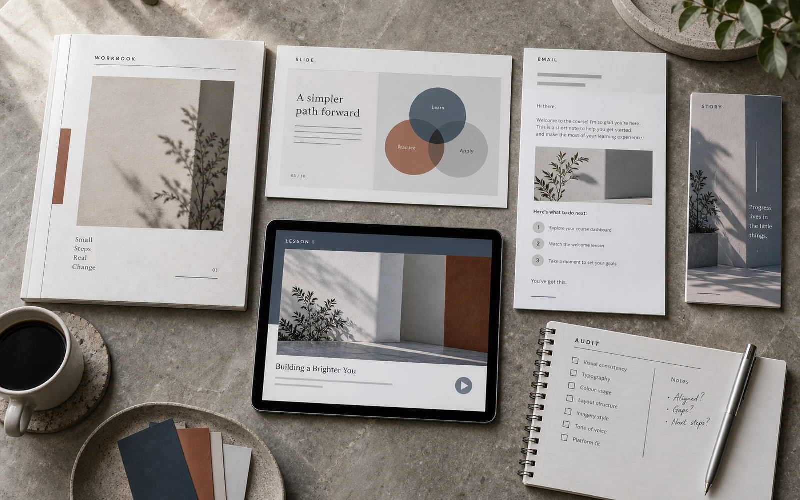
A workbook can hold several levels on one page. A slide holds fewer. Stories hold still less: one gesture and a brief note. The range changes. The logic does not. If “primary” means something different in each of the three, the student has to relearn the language of the course every time.
Contrast gives a foothold
Contrast is a difference the eye notices without effort: light against dark, thin against bold, calm text against one clear accent. In learning it is not there for drama. It is there so the student can stop.
A rule, a definition, a conclusion, a prompt for an exercise — these are stopping points. If they look like any other paragraph, the reader moves past them. If there are too many stops, the page begins to argue with itself. Contrast works when it is scarce and repeatable.
Colour is a fragile signal. One accent tone can mark action: do this, write this, move on. Another can mark service: numbers, captions, navigation. If every important phrase is painted a new colour, the student stops trusting the accent. Type weight works the same way. A highlighted sentence is useful once per thought. When every other word is emphasised, what remains is noise. One clear conclusion after a block is worth more than ten stresses inside it.
On slides, contrast is stricter still. A lesson screen or a Stories frame does not give time to decode. One thesis. One foothold. Everything secondary either leaves or becomes a caption. A workbook can hold density. A slide holds hierarchy more severely: when everything is contrast, nothing is.
A student should not have to learn the subject and decode the page at the same time. Hierarchy takes on the second task.
Spacing gathers meaning
Space on the page is not emptiness for the sake of beauty. A margin shows a relationship before a sentence can explain it. What sits close is read as one idea. What is separated is read as the next step.
If a definition is pressed against a random paragraph, it does not look like a definition. If an exercise has no field of space around it, it reads as another stretch of theory. If a diagram is dropped in without a pause, the eye has no time to change mode — from reading to looking.
Dense content needs these pauses at the joints between roles: after a title, before an example, between explanation and action, around a model. Not everywhere. Space everywhere is sparseness, and the text falls apart. If a change of role is not marked, the parts of the lesson fuse into a single stream.
In a worksheet, the question, the hint and the answer field should group as one action. The next exercise should group as the next. When every line sits at the same distance, the form looks filled but unmanaged. The student sees a place to write and barely knows where a separate step begins.
Consistent margins and predictable intervals between heading and text are not pedantry. They are the rhythm in which complex material stops being chaos. Across a long module, that knowledge accumulates. There is no need, each time, to search for the edge, the paragraph, and the place to act.
Repetition makes the path predictable
When theory always looks like theory, an example like an example, and an exercise like a field for action, the student stops spending attention on how the page is built. They recognise the type and move straight to the content. That is information rhythm.
Repetition is not only colour. It is where the module number sits. It is the way a definition is always presented. It is a stable composition for a thesis slide. It is the same logic in Stories: a heading, one thought, a short note. It is a worksheet where the instruction always sits above the field, never somewhere to the side.
Without repetition, every spread becomes a new puzzle. The author may call this variety. For the student it is friction. In a long course it accumulates. People tire not from the complexity of the ideas, but from having to learn, each time, how to read the page.
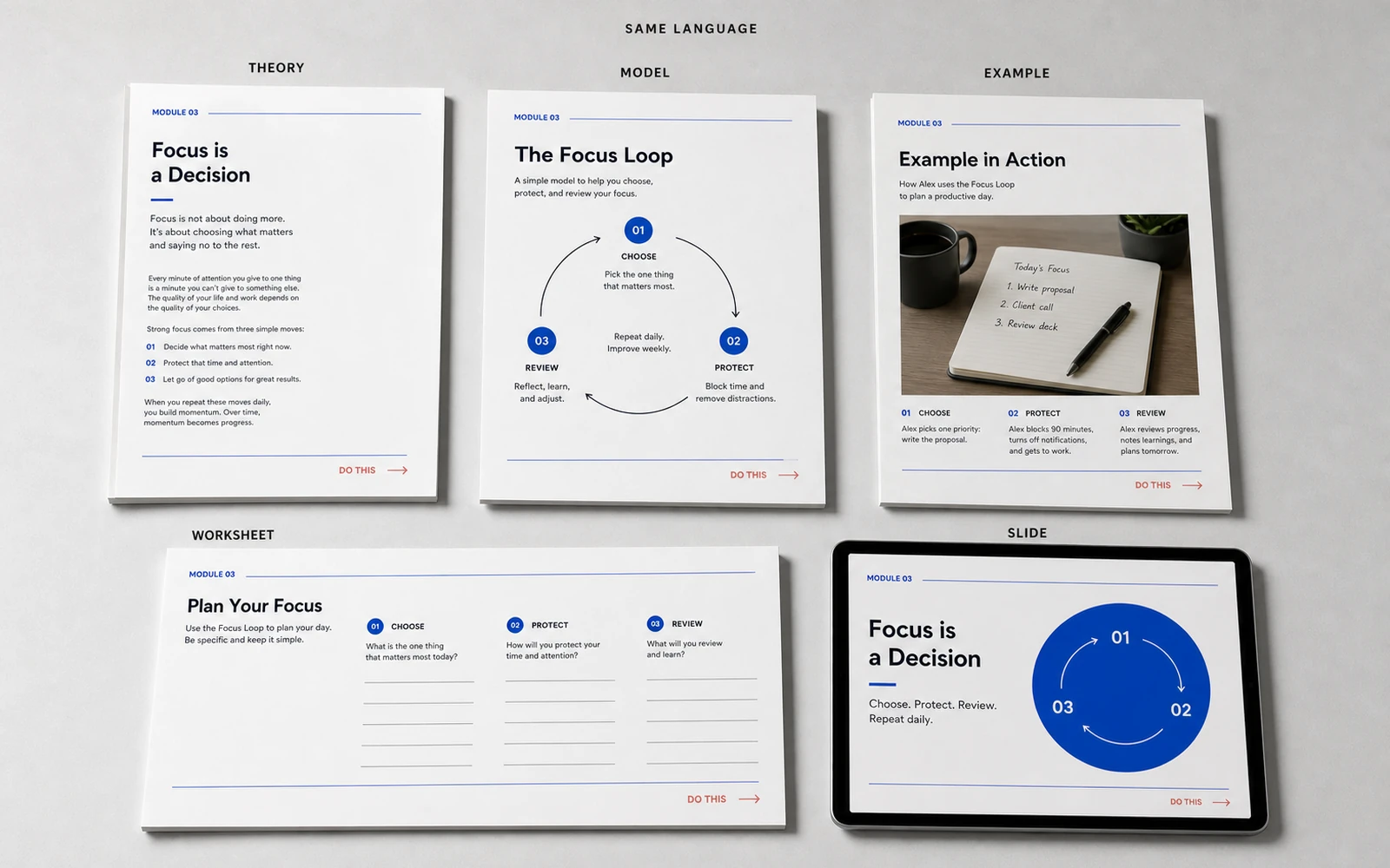
Repetition does not mean every page looks the same. A dense theory spread and an open page of reflection can differ in tension. What must stay the same is the character of the decisions: the same heading levels, the same accent rules, the same logic of grouping. Density can change. Language should not. Complex content needs this predictability more than light content does. Where ideas are many, every extra puzzle costs understanding.
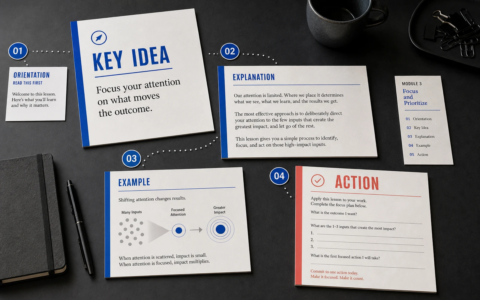
What the path through a lesson looks like
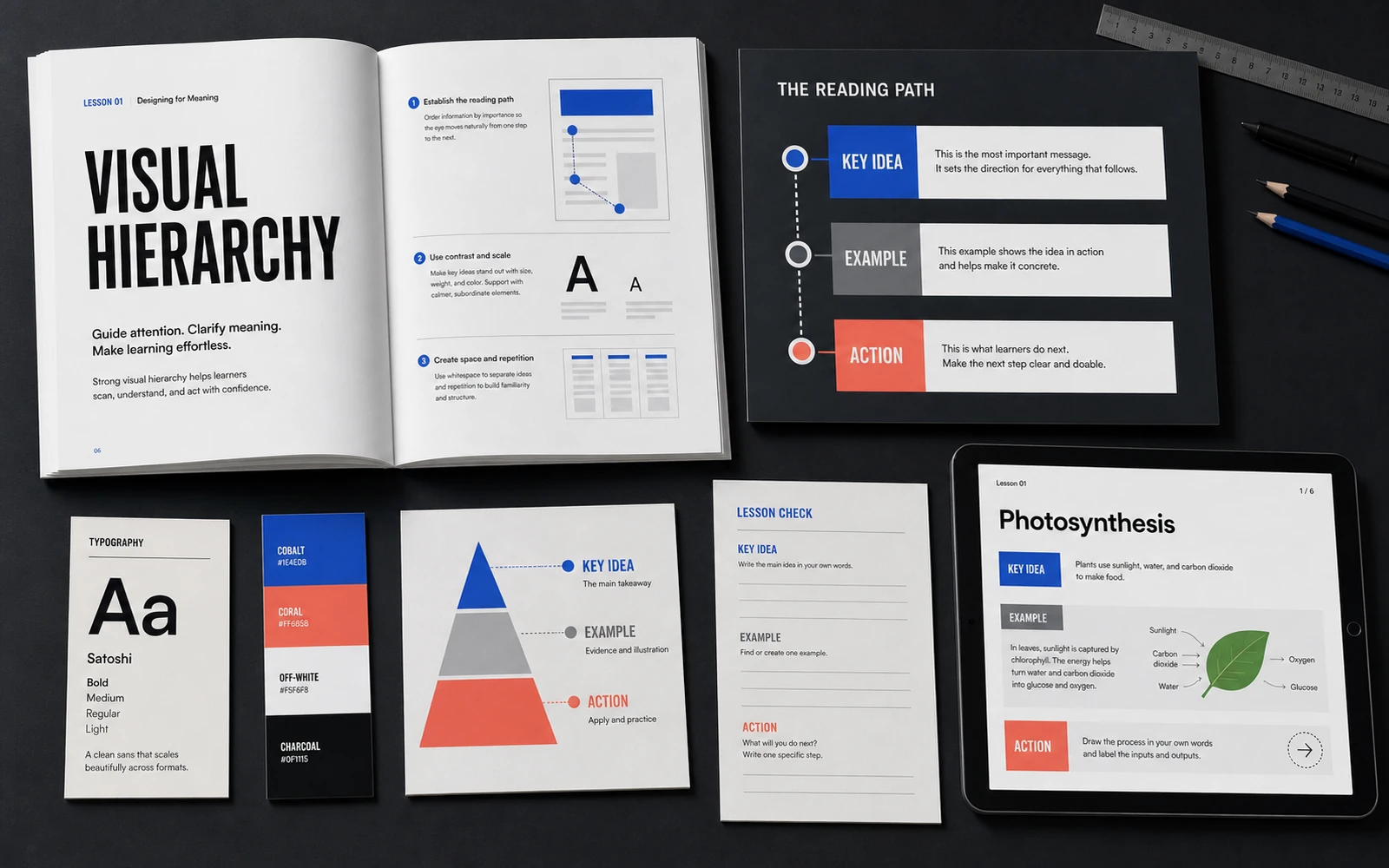
The practical route is almost always the same, even when the subject is dense. First, orientation: where we are in the programme, and why this fragment exists. Then the main thought — one, not seven. Then an explanation that unfolds that thought, without replacing it with new theses. Then an example or a model. Finally, action: a question, a worksheet, a short task, a place for a note.
Visually, the path is built like this. Title and service marks sit in a separate upper layer — small and stable. The thesis is the largest content gesture on the page. Explanation is body text of calm density. The example is separated by space or a quieter ground, not by a different aesthetic. Action carries a different contrast: a field, a marker, a short instruction.
When this order breaks, the student wanders. Sometimes the exercise sits above the thesis — and the person starts doing before they know why. Sometimes the example looks like the governing rule — and a partial case becomes dogma. Sometimes a slide holds four models at once — and none of them stays.
Hierarchy, then, is also honesty of structure. Design cannot invent order that is not in the material. It can, however, reveal disorder. When everything wants to be emphasised, the core of the lesson has usually not been decided. Name the main thing out loud. If it cannot be named, the page will not be able to show it either.
In a launch, the same principle works more briefly. Stories and an announcement should not retell the whole module. They show one foothold — the one the student will later recognise in a heading and a diagram. If the promotional frame shouts and the workbook whispers in even text, hierarchy already breaks at the entrance to the product.
Where hierarchy most often fails
The first break is draft text moved into a layout without a change of roles. A working document can be a precise place to gather thoughts. It is a poor final form for learning, because almost everything in it carries the same weight.
The second is too many highlights. Colour, weight, frames, icons — all at once. The author wants to help. The student sees competing signals. In dense material this is especially costly: there are already many ideas. Every extra mark lowers the value of the real one.
The third is accidental scale across formats. In the workbook a heading of one level, on the slide another, in Stories a third — with no shared rule. The course never gathers into one language, even when the palette is the same.
The fourth is diagrams without a place in the hierarchy. A model takes half the page, yet it is unclear whether it is the governing idea or an illustration of a paragraph. Dense content often lives in diagrams. If they are not built into the path, they become pictures beside the text.
The fifth is the absence of repeated page types. Each module is assembled as a new object. That is expensive to produce and hard to learn from. Several precise templates — theory, model, example, worksheet, conclusion — serve better than inventiveness without rhythm. And one more: service should not compete with content. A page number, an extra line of navigation, a decorative rule beside every heading — these consume the contrast meant for the thesis.
Complexity should be passable, not simplified
Visual hierarchy does not simplify expertise. It makes it passable. The student still has to think. They should not, at the same time, have to solve what on the page is structure.
When scale, contrast, spacing and repetition hold together, a dense lesson stops being a flat wall. A path appears: first this, then this, now do. The author hands over not only knowledge, but the order in which that knowledge should be met.
That is why hierarchy in an educational product is part of the learning, not a finishing coat of style. It should be built with the structure of the module. Then the workbook, the slides, the worksheets and even short Stories lead attention in one direction. The student spends less force building a frame. They spend it on the content — where it belongs.
Discuss your course