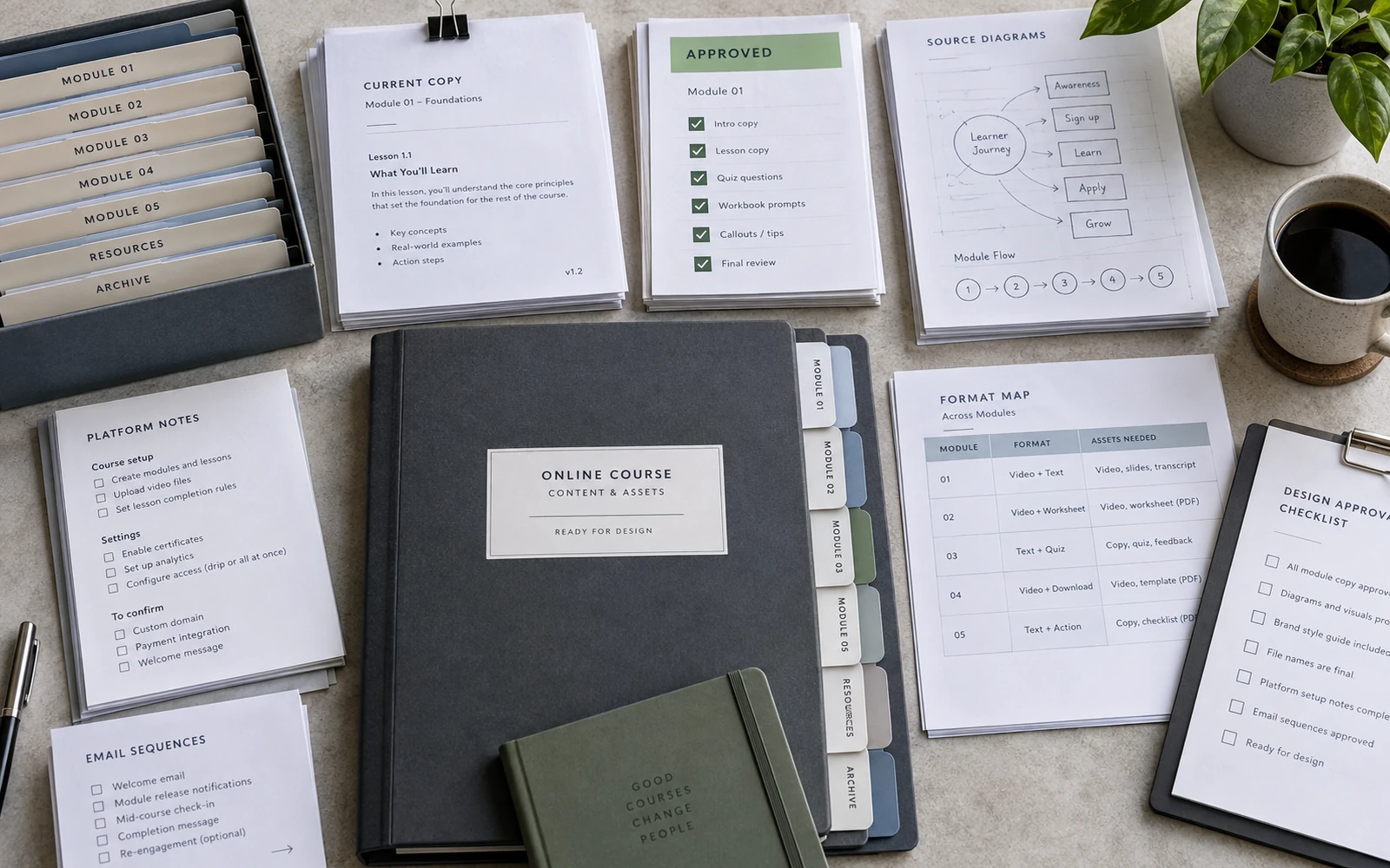
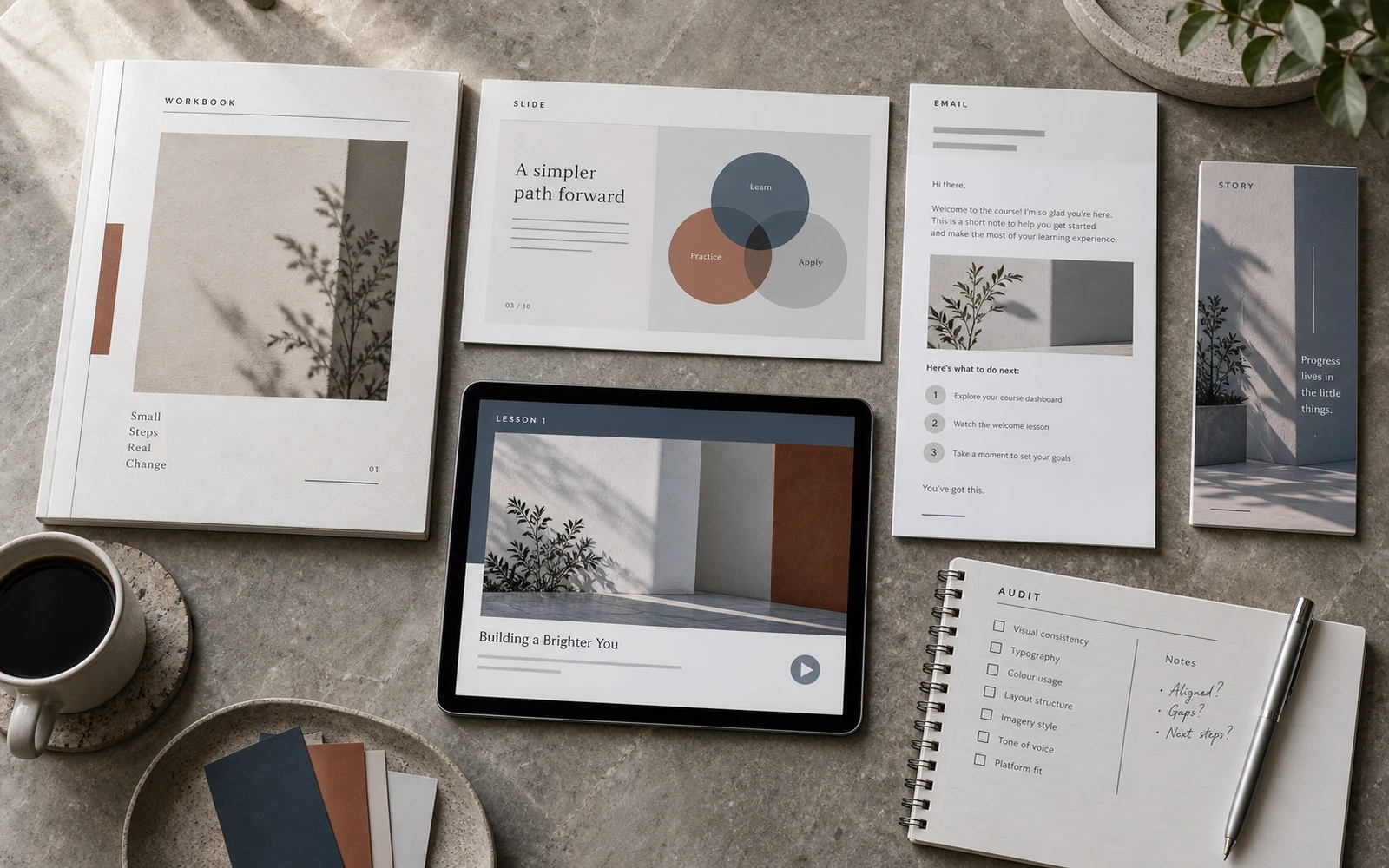
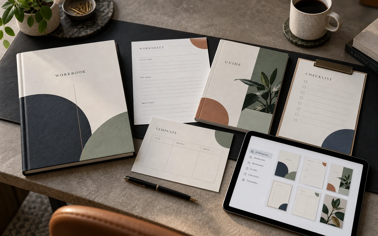
Expert knowledge rarely arrives as a finished design brief. More often, the work begins with a folder: long documents, notes from consultations, whiteboard diagrams, chat screenshots, draft slides, and an old PDF that “still works, somehow.” All of it is valuable. None of it is yet an educational product. It is raw material, from which a product still has to be built.
The course designer’s task is not to decorate that folder. It is to move the material through audit, hierarchy, character, templates and production — so the student receives a clear route, and the launch reads as a continuation of the same course, not a separate campaign. What follows is the practical sequence in which this happens.
Audit: name what already exists
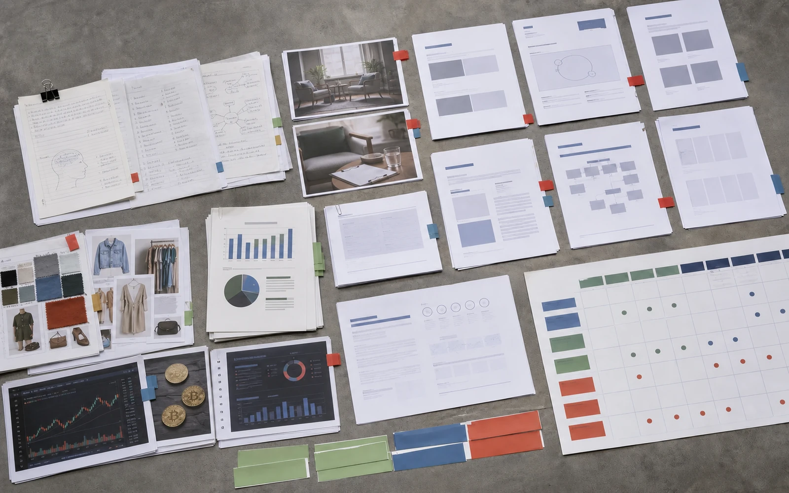
The first step almost never looks creative. It is an inventory. Everything that exists has to be gathered, then sorted: approved from draft, a stable module from a topic still in flux, the author’s actual model from a metaphor offered in passing.
An audit answers specific questions. How many types of information does the course contain: theory, example, exercise, diagram, checklist, reflection? Where is the text dense and in need of quiet typography, and where should it become a field for action? Which formats will the student and the buyer actually encounter: workbook, worksheets, slides, a guide, launch materials? What can be unified, and what is a distinctive authorial gesture that must not dissolve into a template?
Without this step, design starts dressing chaos. Pages appear quickly, but the hierarchy remains accidental. A month later the module is rewritten, a diagram is replaced, and half the spreads no longer match the logic of the programme. A useful discipline: do not choose a palette until it is clear where long text will sit and where a table will sit. Colour does not rescue unstructured material. It only makes disorder look tidier.
In practice, an audit looks like a table of formats and page types, not a board of references. Without that sheet, the team argues about typefaces before it has agreed on what is being designed.
From expert logic to the student’s route
Once the material is gathered, it has to be translated. An expert thinks in themes, years of practice and exceptions. A student moves lesson by lesson: what matters now, what is explanation, what must be done by hand, where to return later. Skip this translation, and the workbook will reproduce the author’s inner order rather than a path of learning.
This is where a map of the experience appears. It need not be elaborate. It is enough to answer honestly: what a person sees before purchase, what they open on day one, what a typical lesson looks like, where they read, where they write, where they watch a slide. Workbook, slides and worksheets stop being separate files. They become roles in a single sequence.
Hierarchy here is not a larger point size on the heading. It is a decision: what is a module, what is a lesson, what is a definition, what is an example, what is an action. If everything looks equally important, the student is forced to build the structure themselves. Design then spends attention instead of conserving it.
The practical consequence: page types are fixed before decoration. A theory page. A model page. An exercise page. A worksheet. A conclusions spread. A module cover. Once the types are named, a system can be designed. Until they are named, every page becomes a unique object, and production grows more expensive than it needs to be.
This is also the moment to pause and check the programme, not only the visual. If there is no transition between topics, if an exercise does not follow from the theory, if a model is mentioned but never assembled — design will only make the gap more visible. Better to see it on the map than to mask it with ornament on page eighty.
Creative direction: character before templates
Only after structure does it make sense to talk about character. Creative direction for an educational product is not a collection of images in pursuit of atmosphere. It is an answer: in what language should the course speak, once the knowledge inside it is already serious? Calm and dense? Airy, but precise? Closer to a publication, or to a working tool?
This is when typography, palette, image tone, diagram logic and a few key spreads are chosen. The direction is not tested on a cover. A cover forgives almost everything. It is tested on a dense page: long text, subheads, a note, a diagram, a writing field. If the system holds under that pressure, it will hold across the remaining formats.
It is easy, here, to substitute the brief with references from other industries. A magazine, a fashion house, an architecture studio can supply a precise mood. But a course needs a language that can carry definitions, tables, multi-step exercises, and a slide that leaves one thought on screen. If the direction cannot do that, it is decorative — however premium it looks at first glance.
A second test is stricter still: does the character survive repetition? An educational product does not live in a single spread. It lives across dozens of pages, a presentation, a short launch frame. If the aesthetic is interesting only once, it cannot be scaled. If it holds a rhythm, it can become a system.
Raw material becomes a product not when a cover appears, but when the same order can be repeated on a page, on a slide and in the launch.
Templates built to be filled
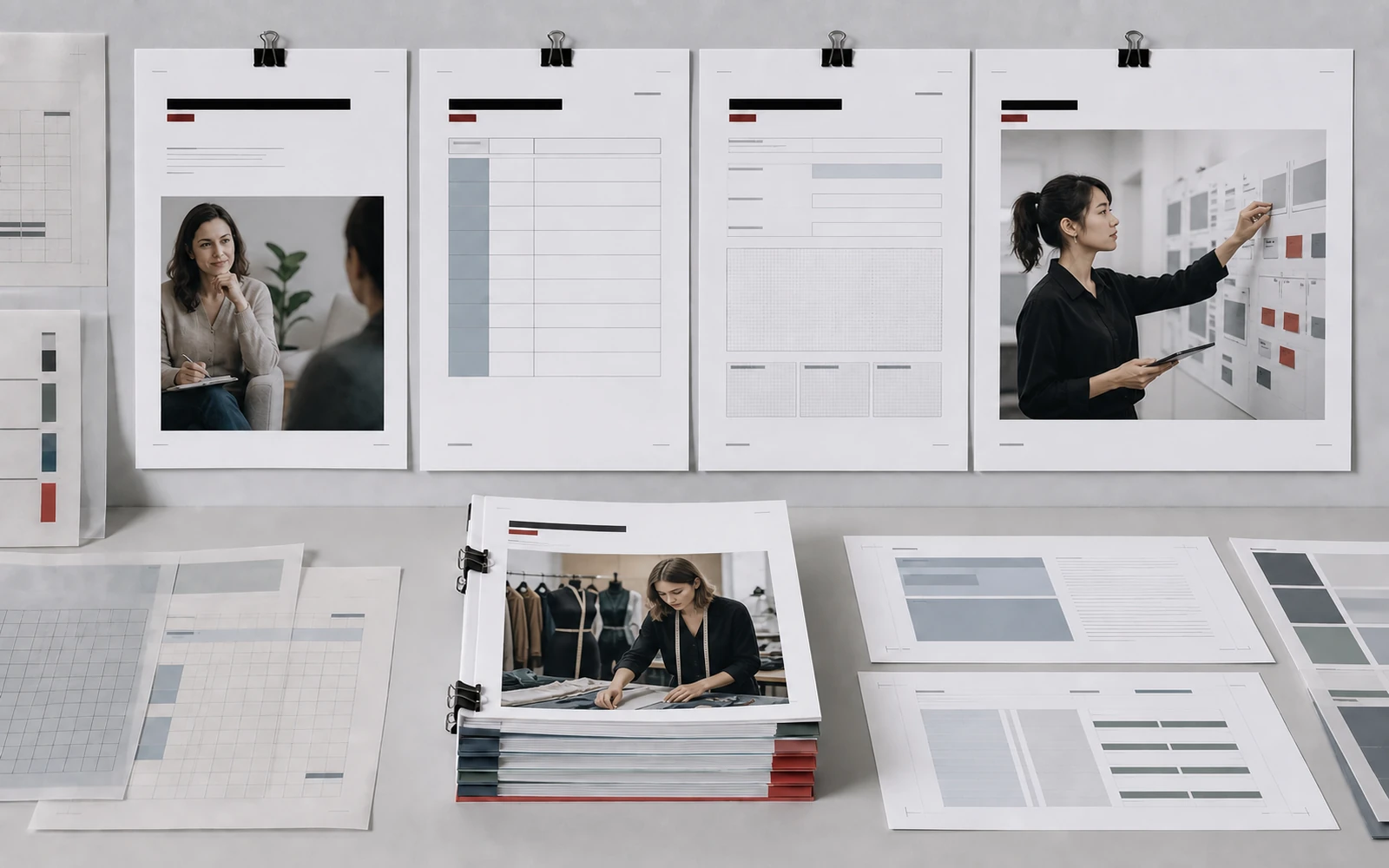
A course design system does not live in a presentation “about the brand.” It lives in page templates and in the rules for moving between formats. A template is not a cell into which any text is forced. It is a repeatable logic: where the lesson title sits, where theory begins, how an exercise instruction looks, where the page number goes, how a diagram is captioned.
Once that is fixed, a new module does not require a new design. It requires filling. For a workbook, this means a limited set of layouts. For slides — a few frame types: thesis, model, example, transition, question. For worksheets — fields, scales, space for a short answer, space for a conclusion. The system is valuable because these formats recognise one another.
This is where the economics of the project are set. If every page is unique, eighty pages are eighty separate decisions. If there are eight or twelve types, production becomes predictable and quality becomes even. Evenness matters more than spectacle here. A student trusts not an explosive spread, but the fact that page ten holds the same standard as page two.
Templates also protect the author’s gesture. When the frame is stable, a unique model can be assembled as an exception — deliberately, once, on a dedicated spread. Without a frame, everything becomes unique, and nothing looks important any longer.
Production: discipline after the idea
Once templates are approved, the longest part of the work begins. It is the least spectacular and the most consequential. Production tests whether the system can live with real content. Texts turn out longer. Diagrams, more complex. Exercises, uneven. Modules have different densities.
If the designer invents an exception at every turn, the system falls apart. If, conversely, living material is cut rigidly to the grid, the content suffers. The right position sits in the middle. The template holds the frame. The content receives local deviations where meaning requires them: a more complex diagram, a longer case, a dedicated spread for the author’s model. Deviations must be deliberate, not accidental.
A few rules reduce chaos. Gather a module’s content in full, rather than page by page “as it becomes ready.” Unify diagrams before final layout: one language of arrows, captions, levels. Design worksheets alongside the theory, not at the end if space remains. Slides should be born from the workbook’s hierarchy, not from a separate set of talking points written the night before class.
Production also reveals the limits of collaboration. Design does not write the programme in the expert’s place. But it makes the gaps visible. When a page will not assemble, the problem is often not the grid, but a thought that has not yet been formulated. This is worth saying calmly and in time. Otherwise a deadline turns unclarity into decoration.
Launch as a continuation of the learning language
Once the learning core is assembled, the temptation is to hand launch off separately. This is where a product often breaks. Before the first lesson, a person has already met the course several times: an announcement, stories, a webinar, a page, an email. If those materials speak a different language from the workbook, expectation diverges from experience.
Launch should look like the same product in a shorter format. In practice this means: grid, typography, diagram character and frame tone carry over into the creatives. Workbook pages are not copied into a square. They are translated. A module title can become a frame. A model — a short visual argument. A phrase from a lesson — a quiet accent in a carousel. Launch materials should not shout louder than the knowledge. They compress the same language.
The list of formats depends on the product, but the logic is the same. A webinar cover, a series of posts, stories, a banner, a landing visual — all of it should pass a test without the logo. If, without the course name, it is already clear this is a continuation of the learning materials, the system is assembled. If not, launch will again become an accidental layer on top of the product.
There is an internal effect, no less important than the external one. When launch is built from the same system, the next cohort does not start from zero. What appears is not a one-off campaign, but a language that can be repeated, refined and extended.

Handover: so the product can live on
The design of an educational product does not end with a final PDF. It ends with handover. The expert or the team needs to understand how to add a module, how to assemble a new worksheet, how to make the next series of creatives without breaking the language.
This requires more than files. It requires rules: page types, diagram states, permitted deviations, heading hierarchy, behaviour on a slide and in a short frame. Handover is also an honest conversation about limits. What can be changed independently. Where it is better to return to the designer. Which texts are still raw and should not enter the final templates.
A system reduces the cost of the next cohort only when it is used, not when it sits in a folder with several “final” versions. So at delivery it is worth showing not only handsome spreads, but a working gesture: how a new lesson is assembled from an existing template, how a diagram stays recognisable, how a launch frame takes a module title rather than inventing another character.
At this stage the product becomes cohesive. Not because every format was made at once. But because they answer to one hierarchy, one character and one student route.
From raw material to launch
The path from expert content to an educational product is not linear in the details. Texts are refined. Modules are shortened. Diagrams are rebuilt. But the sequence of decisions should remain clear: first audit, then hierarchy, then character, then templates, then production, then launch, then handover.
Start with the cover, and you will get a cover. Start with page types and the student’s route, and you will get a product that can hold dense text, an exercise, a slide and the first launch frame. The expertise is already there. It does not need a theatrical gesture. It needs an order in which knowledge can be walked through, applied and recognised — before the first lesson even opens.
Discuss your course