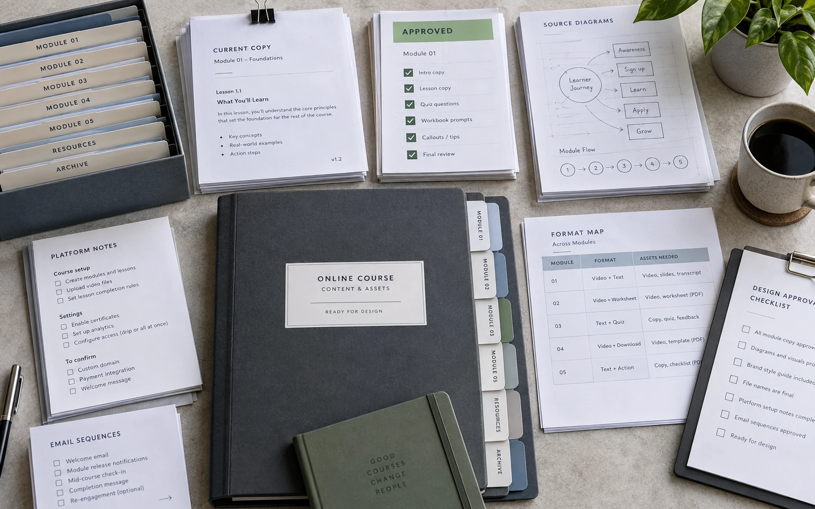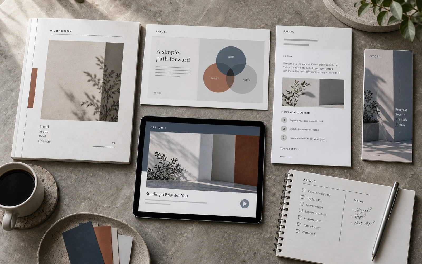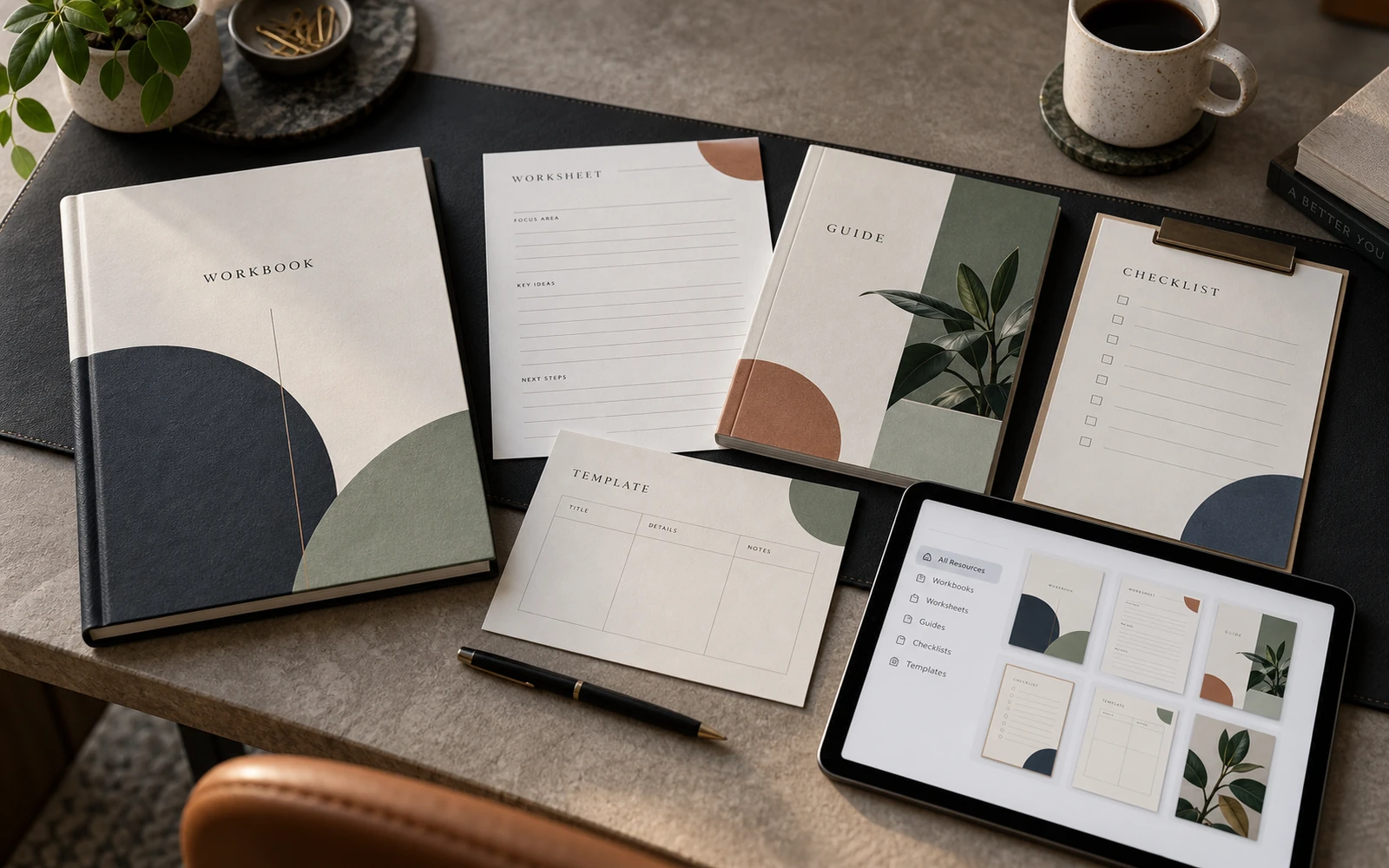
A learner rarely names why one course feels composed and another does not. They will not say “the hierarchy is working” or “the module has a considered pace.” They simply trust, or they hesitate. They sense that the product already exists as a whole — or that it was assembled from handsome fragments. Premium in an educational product is born here: not in the cover, not in the palette, but in how hundreds of small decisions accumulate into one experience.
Visual quality matters. Type, margins, contrast and grid all do real work. They are not enough. Premium perception is built through clarity, consistency, pacing and considered learner touchpoints. These are what make a course feel thought through, reliable, and worth its price.
Premium is a cumulative effect
People look for a single cause. “Change the colour.” “Commission a better mockup.” “Use a quieter serif.” These are convenient answers, because they look like a task. Premium is not a layer you can apply on top. It is the consequence of how the product behaves at every step.
If the heading is clear but the navigation is confused, the effect collapses. If the workbook is carefully made but the first email after payment reads like an internal memo, the effect collapses. If the slide is tidy but the learner does not know what to do next, the effect collapses. The right question is not “how do we make this look premium,” but “which decisions repeat with enough precision that a person can feel the attention.”
Attention is the operative word. A premium product does not explain its value through decoration. It shows that someone has already thought on the learner’s behalf: where to begin, where to pause, where to act, where to return. This is read faster than it is named. That is why premium cannot be reduced to a reference that looks like an expensive brand. An educational product has different work to do than a magazine or a hotel. It has to carry someone through complex material and not lose them between formats.
Clarity you can see from the first page
Clarity is the first sign that design is serving learning, not impression. Within a few seconds the learner should know: where they are, what is primary on the page, what is secondary, and what happens next.
It begins with hierarchy. A module title should not look like a caption to a diagram. A definition should not disguise itself as a paragraph. An exercise should not hide among the theory. When everything is set in one size and one accent, the person has to build the structure themselves. That is tiring. Fatigue never reads as quality.
Clarity also lives in the language of the course itself. Lesson numbering, section titles, step labels, the marks that say “read,” “do,” “return.” When these signals stay stable, the learner thinks less about navigation and more about the material. When they change from page to page, even strong content feels unfinished. The person stops learning and starts decoding the interface.
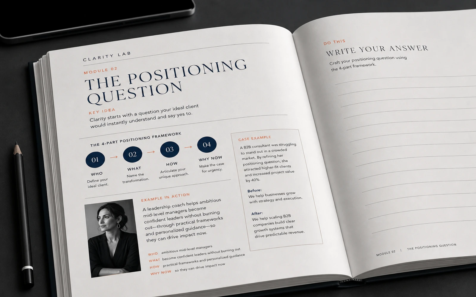
In a workbook, clarity is most honest where there is a lot of text, a table, a diagram and a field for writing. If that page reads calmly, the system can hold real expertise. If it falls apart, no atmospheric spread will compensate. The same is true of a slide: it is not premium because it has few words, but because it carries one claim, one visual anchor, and a clear next step.
Consistency recognised without a name
Consistency is not “everything looks the same.” It is a recognisable character across formats. Workbook, slides, Stories, email, certificate and launch frame can have different density and different tension. They still have to belong to one product.
The learner registers this physically. They open a lesson and already know where to look for a definition. They see a slide and recognise the same grid that lived in the workbook. They meet Stories before a cohort starts and do not feel they have arrived in another brand. This is what builds trust. Not a claim about level, but repeated attention to detail: margins, page types, the character of diagrams, the way an action is labelled.
When consistency is missing, a quiet friction appears. The person does not necessarily leave. They simply believe less that the product has been composed. And composure is part of what people pay for in high-priced programmes. They are not buying access to lessons alone. They are buying the sense that the path has already been designed.
Consistency also conserves the expert’s energy. Each new module, each exercise sheet, each series of Stories ceases to be its own mini-project. Rules appear: how theory looks, how action looks, how a pause looks. This is not bureaucracy. It is quality infrastructure. Without it, premium has to be invented again every time — and it inevitably becomes uneven.
Premium does not rest on one successful screen. It is held by repeated attention: from the first touch to the last exercise.
Pacing, without which a clear course still exhausts
Pacing is the least decorative quality, and the one most often skipped. It is not only about air on the page. It is about how density and pause alternate across the whole learning experience.
A module of twenty consecutive pages of theory feels heavy even when the typesetting is careful. A lesson that plants an exercise after every thought feels jagged. A slide that tries to say everything at once gives the listener nothing to hold. A workbook without a page of return and synthesis leaves knowledge scattered. In each case the problem is not that the material is “not beautiful enough.” The problem is that the experience has no breath.
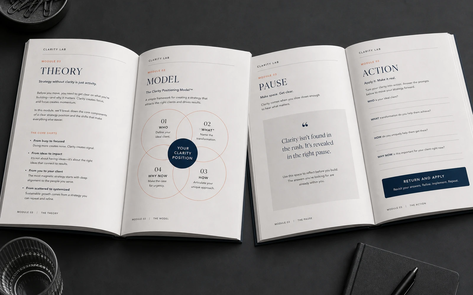
Pacing is designed. Theory. Example. Diagram. Pause. Action. A short conclusion. Then theory again, at another level. When this pattern repeats, the learner begins to move with the material. They know the tension will not be endless. They know that after a model there will be a field in which to apply it. That predictability does not make a course dull. It makes it safe for complex thought.
The same holds for launch. If every Stories frame presses with the same force, attention switches off quickly. If the sales page, the webinar and the email speak at different tempos, the offer feels less composed than it is. Pacing is respect for a person’s attention. And respect for attention is always read as a standard.
Touchpoints rarely treated as design
A premium course is not performed only in the lesson. It is performed in the moments usually left “for later”: the email after payment, the login instruction, the first screen of the platform, the file name, the module cover, the blank page before the start, the reminder inside the programme, the certificate.
These are the points that decide whether the product feels whole. The learner has already paid. They are vulnerable: they want confirmation that the decision was right. If the first contact after purchase is accidental, doubt arrives before the first lesson. If that first contact is clear and calm, learning begins before the module opens. The person already feels they have been thought of.
Inside the learning itself there are many touchpoints too. The shift from video to workbook. The caption that says which page to open. The answer field that does not look like a random rectangle. The diagram that can be saved and understood without the neighbouring paragraph. Stories during a cohort that do not sell the product again, but hold the rhythm of the programme. Each of these encounters can be neutral, can obstruct, or can support.
Premium appears when most of them support. Not perfectly in every detail. Consistently in character. The learner will not remember the kerning. They will remember that they never had to guess what to do next.
What is mistaken for premium
A palette does not make a course premium. A dark ground, muted beiges, a quiet serif can be appropriate. They can also not be. Colour works only inside a system of decisions. On its own it is taste, not quality. You can assemble a restrained range and still leave the learner without hierarchy, without pace, and without a clear action.
A mockup is not proof either. It shows an object in space: paper, light, shadow, a table. It is useful for presenting the work. It says nothing about whether a person will find the exercise, whether a diagram reads on a phone, whether a slide holds in a real lesson. If premium exists only in the mockup, it does not exist in the learner’s life.
Do not confuse premium with decorative restraint. Plenty of air is not yet clarity. Little decoration is not yet a system. Generous margins can mask a missing structure as successfully as ornament can mask a weak hierarchy. The real test is not “does the page look calm,” but “does the page lead.”
There is another displacement: copying the aesthetic of a fashionable brand as if an educational product were an object of style. A course has to hold attention through long text, carry someone through a model, make room for writing, survive a launch, and keep its character in Stories. If those tasks are not named, design becomes stylisation. Stylisation can be liked. It rarely survives learning.
How to tell if the product is already composed
A few checks require no separate research. They take an evening and immediately show where premium is present, and where it is only declared.
First. Open the cover, a dense workbook page, one slide, one Stories frame and the email after payment. Remove the product name. If a single character still holds — the language is composed. If not, premium is local: it lives in isolated files, not in the experience.
Second. Walk the first twenty minutes as a new person. From the email to the first exercise. Where did you stop to understand what to do? Each of those pauses is not a detail. It is a place where the product either supports, or leaves the learner alone.
Third. Look at the pace of one module. Is there a change in density? After a complex model, is there a page of application? Does the conclusion look like more than an accidental last paragraph? If the module is only a stack of materials, there is no premium — even if each file is tidy on its own.

The fourth check is internal. Try adding a new lesson. If you have to invent a new page logic, new diagrams and new labels, the system was decoration. If you take existing types and fill them, the product has a spine. It is the spine, not the mood of the cover, that lets a course stay premium in a second cohort, and after a module is updated.
A price the experience can justify
People rarely buy “design.” They buy the sense that knowledge is presented with the same respect with which it was gathered. When clarity, consistency, pacing and touchpoints are composed, the price needs fewer separate explanations. It is read from the experience: from the page, from the slide, from the first email, from the first exercise.
This does not mean visuals replace content. A weak programme in a strong shell disappoints even faster. But strong content in an accidental presentation works constantly against itself. The learner spends attention on orientation. The buyer compares for longer. The expert reassembles the product every time and wonders why the material “does not feel at the level.”
So premium should be designed as a quality of the system, not as the style of the first screen. Start with the clarity of the page. Fix the rules that can be repeated in slides and Stories. Build the pace of the module. Walk every learner touchpoint — especially those usually left for later.
When these layers hold together, the course stops being a set of materials. It begins to feel like an educational product. That, not the palette and not the mockup, is what makes it worth its price.
Discuss your course