A student rarely stays in one mode for more than a few minutes. They look at a slide, listen, drop their eyes to the workbook, write a phrase, look up again. After the session, the presentation is gone. What remains is a page where thinking can slow down: reread the model, return to the example, complete the exercise. A course lives in that movement — between screen and page, between someone else’s voice and one’s own writing.
When slides and workbook speak different languages, the movement becomes labour. Attention goes not to the idea, but to locating it: where am I, and what was that thing on the slide called. A shared structure removes the friction. Teaching becomes clearer. The product becomes more memorable. Not because both files look polished, but because they hold one thought at two densities.
Learning happens between the screen and the page
Watch a typical module. The instructor opens a slide with the name of a model. Names three steps. Shows an example. Asks the room to open the workbook and write their own case into the same frame. A short pause, a few clarifications, the next slide. A day later the student returns to the PDF: looking for that same model, wanting to recall the instructor’s gesture, finishing what there was no time for live.
In a recording the logic is the same, only without a shared room. The person pauses the video, looks at a frozen frame, turns pages, writes, presses play. Each cycle is a micro-translation from one medium to another. If the name, the order of steps, and the look of the diagram match, the translation is almost invisible. If they do not, the student rebuilds the map of the course every time.
This is where the habit of screenshotting the slide begins. It is not admiration for the design. It is insurance: the person is not sure they will find the same thought in the materials. The workbook should be the place the thought lands. When it cannot be recognised from the slide, the student builds a third medium — a folder of screenshots, notes, and arrows. The course exists, but it has to be assembled by hand.
Friction does not accumulate in a single lesson. It accumulates over weeks. Module by module, the person learns not only the content, but how far they can trust the pair “shown — written down”. Where that trust exists, attention goes into the material. Where it does not, part of the lesson is spent on orientation.

Different jobs, a shared grammar
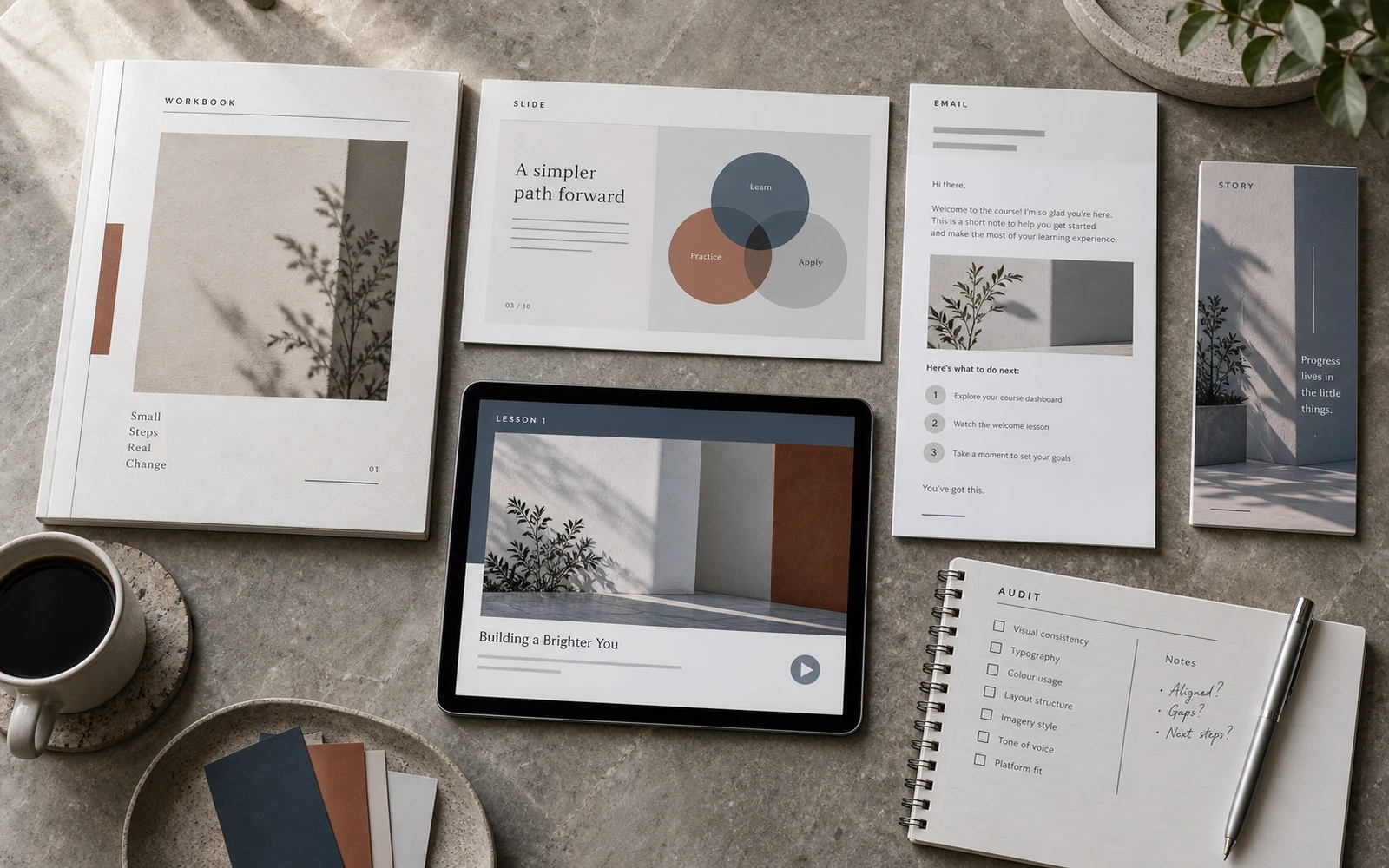
A slide and a workbook page should not be copies. They do different work.
A slide exists in time. It is read with a voice. It needs one thought that can be pointed at. Too much text, and the instructor competes with their own screen. Too little structure, and after the session there is nothing to hold onto. The slide holds the rhythm of the lesson: entry into the topic, the model, the example, a pause for action.
The workbook exists in space. It is read in silence, often later, often in fragments. Here density is required: a definition that can be reread; an example expanded further than on the slide; a field where one’s own text can land. The page has to survive a return a week later, when the voice is gone.
A shared language is not “make the slide look like the PDF”. It is a shared grammar. The same module name. The same lesson number. The same model title. The same order of steps. The same signal that this is a definition, this is an example, this is a place to act. Density and tempo change. The character of the thought does not.
Without that grammar, an illusion of richness appears: “brief on the slides, deep in the workbook”. In practice the student receives two retellings of the same course. Depth is useful only when it can be found from the screen, without decoding the hierarchy again.
What actually comes apart between the two formats
The rupture rarely looks like a catastrophe. It looks like a small thing that “they will figure out anyway”.
On the slide the model is called “Decision Map”. In the workbook — “Choice Matrix”. The instructor says the first; the page holds the second. The student is not slow. They simply spend half a minute understanding that these are the same thing. Across a module, those half-minutes add up.
Numbering drifts too. The slide is marked as lesson 4. The workbook lives in “block 2.1”, and the exercise sits on page 37 with no clear link to what is on screen. In the room the instructor says: “fill in the table”. Some people are already on it. Some are searching. Some have opened a similar table from the previous module, because visually it is just another grid.
There is a content rupture as well. Three steps on the slide. Four rectangles in the PDF, because “it sat better on the spread”. For the designer this is composition. For the student it is doubt about which version to trust. A model that does not match itself stops being a tool and becomes an illustration.
There is a layer of appearance, subtler than names. If on the slide the model title is large, light, with a short caption, and in the workbook the same thought is buried in a mid-column paragraph, the eye does not recognise rank. The person does not say “the hierarchy is different here”. They say “this feels like a different course”. The brand of an educational product thins at that moment — not in the logo, but in the gesture of recognition.
The slide holds a thought in time. The workbook holds it in space. The student learns in the seam between them.
The seam can be almost invisible. Or it can be the place where one has to stop every time. The design of the pair is what decides which kind of seam it will be.
How to design a pair, not two files
Do not start with slide decoration, or with the workbook cover. Start with the spine of the lesson: what is said, what is shown, what is written.
For each beat of content it is useful to know two places. Where this thought stands on the slide. Where it lives on the page. If the beat exists only in the instructor’s voice, it vanishes after the session. If it exists only in the PDF, it is hard to point to during class. The pair works when showing and writing look at each other.
Build the model once — as a frame. On the slide the frame stands almost empty: a title, the steps, one short example the instructor can unfold in voice. In the workbook the same frame receives density: an explanation of the step, a place for one’s own case, a prompt for what to write, sometimes a second example already without a voice in the room. These are not two drawings on one topic. This is one diagram in two modes of reading.
Navigation should rhyme. A running footer, the module number, a short lesson title, a mark of page type — “model”, “example”, “exercise”. Then the phrase “open the same diagram in the workbook” is not a riddle. It points to a specific place the eye already knows how to recognise.
Sequence is shared too. If the lesson on slides moves as context — model — example — action, the pages should not rearrange that logic merely because “the spread looks better with the exercise first”. The rhythm of teaching and the rhythm of reading may differ in tempo, but not in the order of thought. Otherwise homework feels like a different script, not a continuation.
Decide separately what not to carry across. A slide is not a place for workbook paragraphs. A workbook is not a place for a series of nearly empty frames “like the presentation”. When both media try to be each other, the student loses both the pace of the lesson and the depth of return. An honest division of roles is exactly what a shared grammar makes possible: different sentences, one language.
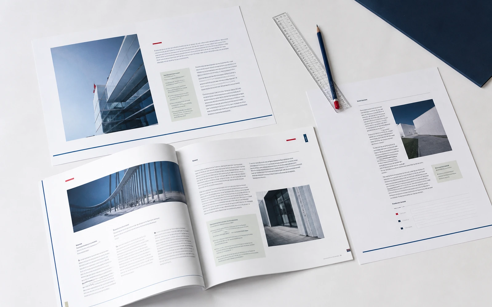
Teaching becomes more precise
When the languages match, it is not only the student’s file that changes. The instructor’s gesture changes.
One can say: “look at the middle step — it is the same on your page”. One can stay silent while people write, knowing they are not writing “somewhere”, but into the frame they just saw. One can return to the model at the end of the module without explaining again where it lives. The lesson spends less time on logistics and more time holding the thought.
This is visible in a live room. The pause for an exercise becomes shorter not because the exercise was cut, but because people find the field faster. “Where is this?” disappears from the chat. The instructor stops describing page coordinates and returns to the content. Precision of gesture saves time that had seemed like mere pacing.
In a recording the effect is even sharper. There is no one to point. There is only a frame and a PDF. If the title on pause and the title on the page match, the student stitches the lesson together themselves. If they do not, they either stop writing, or write in notes outside the course system. Then the workbook after the module remains empty — not from laziness, but from a broken route.
There is an inward effect for the programme author as well. When the pair is designed, adding a lesson becomes easier. A new slide does not invent a new logic of showing. A new page does not invent a new logic of writing. A discipline appears: if a thought cannot be shown and given a place to write at the same time, it is not yet assembled. Design here does not decorate teaching. It tests it.
Recognition accumulates over weeks
An educational brand, for the student, is not the cover on the sales page and not a single stories frame. It is a ritual that repeats for the length of the programme: open the slides, open the workbook, move from listening to writing. This pair lives with the person longer than the launch. If it feels like one author, the course is remembered as a product. If it feels like two contractors, the expert’s name sits on both files, but the experience falls apart.
Recognition here is born from repeating structure, not from ornament. The same way of naming a model. The same way of giving an example. The same way of opening a field for action. After a few modules the student already knows where to look, before they have read the title. This is teaching clarity carried into the materials. It looks calm. And that is why it feels more considered than an incidental “nice presentation” next to an incidental PDF.
There is a practical consequence for later cohorts. When slide and page already know how to look at each other, updating a module does not unmake the product. The example changes, the exercise changes, sometimes the wording of a step changes — but the pair remains. A student in the next cohort enters a familiar gesture, even if the content has been refreshed. The brand holds not on nostalgia for the first version, but on a language that can be continued.
This is also protection against dissolving into templates. It is easy to assemble slides in one tool, the workbook in another, and “tweak a little” each time. After a season the course has four generations of grids and three ways of naming the same thing. A shared structure costs more at the start only because it forces a decision. After that it is cheaper: there is no need to invent, each time, how a thought moves from screen to page.
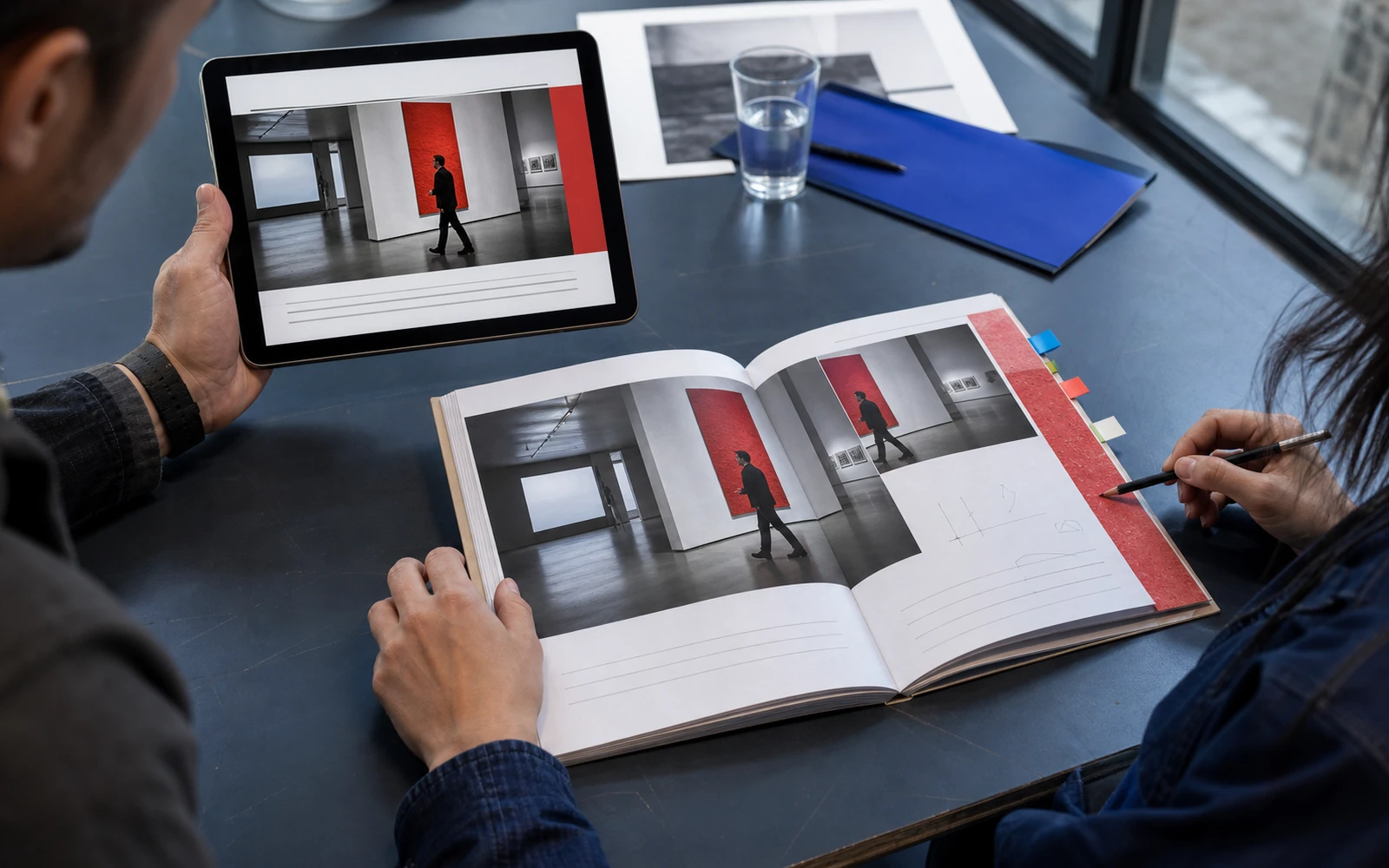
One thought, two formats
Slides do not replace the workbook. The workbook does not replace teaching. Together, though, they either gather the course into a whole or split it in two. The student feels this before they can name it: can I trust what is on the screen, and find it on the page without translating.
So design not “the layout of a presentation” and not “a separate PDF”, but the route of a thought. How it appears in the frame. How it can be pointed at. How it lands in a writing field. How one returns to it a week later. If that route is assembled, the materials stop arguing. The instructor speaks more precisely. The student spends less time assembling the course themselves. The product begins to be recognised from the inside — in daily work, not only on the cover.
If you already have a programme, models, and a voice, the next step is not another layer of decoration. It is making the slide and the page stop being neighbours in a folder, and become a pair that holds learning at the moment of transition.
Discuss your course