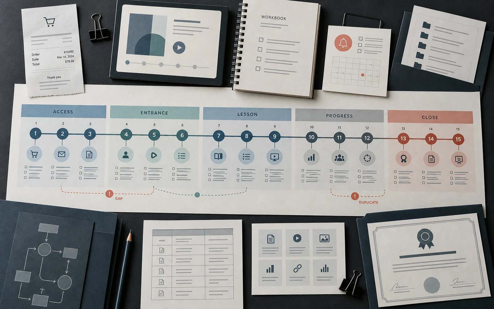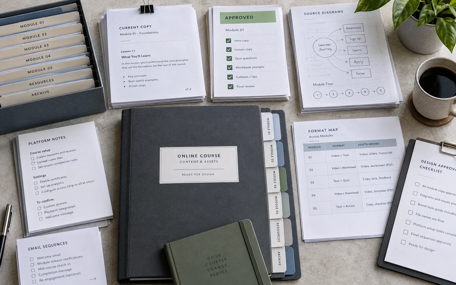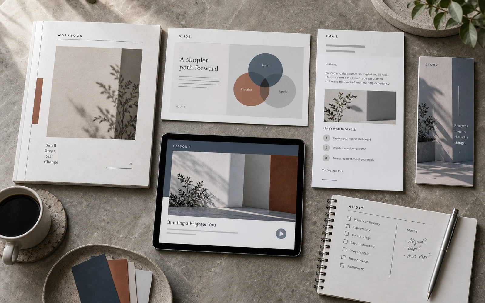
Slides and the workbook usually have an owner. The email after payment, the lesson title on the platform, the reminder between modules and the certificate file — less often. This article does not argue that those moments are “design too.” It is a map of fifteen points you can walk in order and mark: designed, a default from the platform, or missing.
Each point has a job on the path. Not “to look composed.” To make sure a person knows what to open now, what the lesson is called, and where the knowledge goes after the last module.
Design before they have access
01. Sales-page graphics. The person is not a learner yet, but they already see the product. Capture the promise the internal materials will have to keep. Do not try to build the whole campaign here.
02. Payment confirmation: the receipt, the thank-you screen, the platform’s own email. The minimum is what happens next, when access arrives, and where to write if the email never comes.
03. The welcome email: what happens this week, what to open first, what not to do. It should not repeat the sales page, and it should not replace orientation on the platform.
04. Prep instructions: login, which files to download, whether anything needs printing, when the live session is. Without this, people assemble the entrance from three different emails.

Make the first entrance obvious
05. The first screen of the platform and the covers inside the dashboard. In a few seconds it should be clear where lesson 1 is.
06. Module navigation and lesson titles. One name in the dashboard, in the file and on the slide. Different wording for the same topic is the most common small break — the learner hunts for a file instead of the content.
07. Orientation — “how to use this course”: where the video is, where the PDF is, where to submit an exercise, where the community lives. One service page. Not a paragraph at the end of the welcome email, and not a repeat in every module.
Connect the video to the action
08. An address from the lesson to the material. The video or the lesson description points to an exact place: file name, page number, model name. Not “the PDF in Resources.”
09. Lesson slides as a point on the map: the learner understands that what is on screen belongs to this lesson, not to a separate file called “presentation.”
10. The exercise moment: an instruction, a time, a “good enough” criterion, a field that can actually be filled. If the exercise lives only in the speaker’s voice, people screenshot the frame. If it is only an empty rectangle with no task, the point is fake.
11. Feedback: an auto-check, a coach comment, or a short self-assessment. Even a box that asks “what are you taking from this module” belongs on the path. Otherwise the lesson dies after the pause.

Hold progress between modules
12. Reminders between lessons. Their job is the rhythm of the programme for someone already inside it. Not a second offer, and not a recap of the welcome email.
13. Progress marks: a tracker, a module divider, a milestone, quiet community graphics. A visible “you are here” when learning stretches across weeks. Not a badge for the sake of a badge.
Learners drop between modules most often not because the content is weak, but because the product goes quiet or writes in the voice of an email-service template. These two points hold the thread while there is no live lesson.
Design the ending, not only the entrance
14. Final reflection and a resource archive: where the models live, how to come back in a month. Without this the course ends on the last video, and the knowledge stays in a chat thread.
15. The certificate and the next step: community, the next level, a live session. Separate from the archive. A certificate with no invitation is a cut. An invitation with no archive is a call with nowhere to stand.
The entrance gets designed more often because it sits closer to the sale. The ending shows whether the path has a close, or simply fades out.
The map is not there so everything can be “dressed.” It is there to show where the path breaks, repeats itself, or sends someone to the wrong file.
Walk all fifteen points as one path
Before access: offer, confirmation, welcome, prep. Entrance: platform, names, orientation. Lesson: address, slides, exercise, feedback. Between modules: reminders and progress. Close: archive and certificate with a next step.
Walk the map with three marks. Gap — the point is missing. Duplicate — the same instruction is given three times in three ways. Broken link — the lesson or model name does not match between the dashboard and the file. Do not score the character of the system here. Only whether the path is complete and stitched.
When most of the points are named and do not contradict one another, the learner stops assembling the course by hand. They use it — from the email after payment to an archive they can open a month later.