
Aperture
A strategic course designed like an independent publication.
Project overview
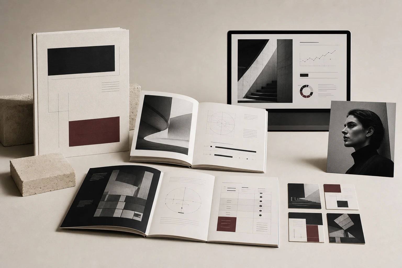
Aperture transforms a dense personal-brand programme into a precise editorial system where every framework, prompt and launch asset speaks with the same quiet confidence.
The challenge
The programme had strong strategic thinking but lived across disconnected documents and improvised social templates. It needed one visual language capable of holding both analysis and aspiration.
Visual direction
Monochrome architecture, disciplined grids and a muted oxblood accent position the course closer to a cultural publication than a conventional coaching product.
The system
The modular system connects a 64-page workbook, positioning frameworks, a presentation library and a restrained campaign toolkit.
Context
A personal brand course presented with the authority of a serious strategic product.
Aperture is a personal brand programme in which participants move well beyond choosing colours or polishing a profile. They examine their audience, articulate a position, define the value of their expertise and build a clearer communication system. The material is rich in models, prompts and decisions, so the design needed to reveal its intellectual weight without making the experience feel like a corporate report.
The course creator supplied the approved curriculum, copy, exercises and strategic models across a collection of documents, tables and presentations. Our role began with a design audit: to give those finished materials one visual hierarchy, a coherent family of layouts and dependable navigation, while leaving the methodology and teaching sequence entirely intact.
Visual direction
A visual language with a clear point of view.
Editorial serif
+ precise grotesk
Creative premise
Aperture brings the right ideas into focus and lets the rest fall away.
The name provided a natural visual principle. In photography, the aperture controls light and depth of field; in personal brand strategy, focus determines what deserves attention and what can remain outside the frame. The idea appears through cropping, generous margins, modular windows and a deliberate contrast between expansive statements and precise analytical detail rather than through a literal camera motif.
We moved away from the decorative optimism common to coaching products and towards the language of an independent journal. It gives the expert authority without corporate distance and makes the workbook feel worth returning to. Restraint is not an aesthetic performance here. It creates room for arguments, examples and the participant’s own thinking to carry the page.
Visual system
Editorial discipline replaces decorative ideas of “premium”.
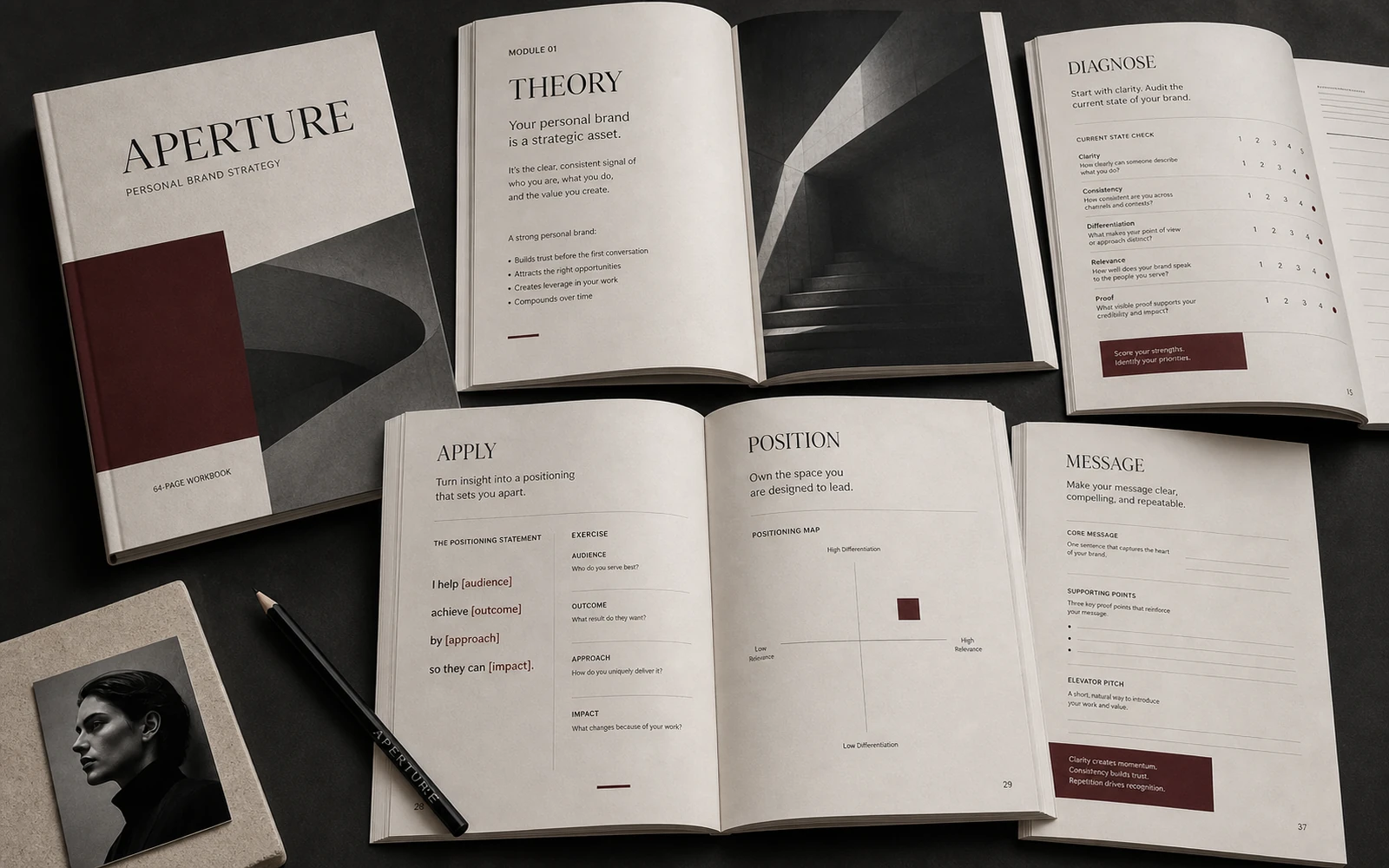
Monochrome photography, a warm paper ground and a deep oxblood accent form the core of the palette. An expressive serif gives major ideas presence, while a precise grotesk handles instructions, captions and navigation. Large statements create deliberate pauses; small metadata keeps modules and steps ordered. The palette is distinctive enough to be recognised, yet quiet enough to let dense copy and diagrams lead.
The grid can hold an isolated proposition as confidently as a compact table. Margins, fine rules, numbering and recurring information blocks create the rhythm of a publication while remaining functional. The same code moves through the workbook, keynote slides, webinar deck and launch graphics by changing scale rather than personality. Repetition becomes the source of coherence.
Visual organisation of the materials
Sixty-four pages and eighteen frameworks read as one connected system.
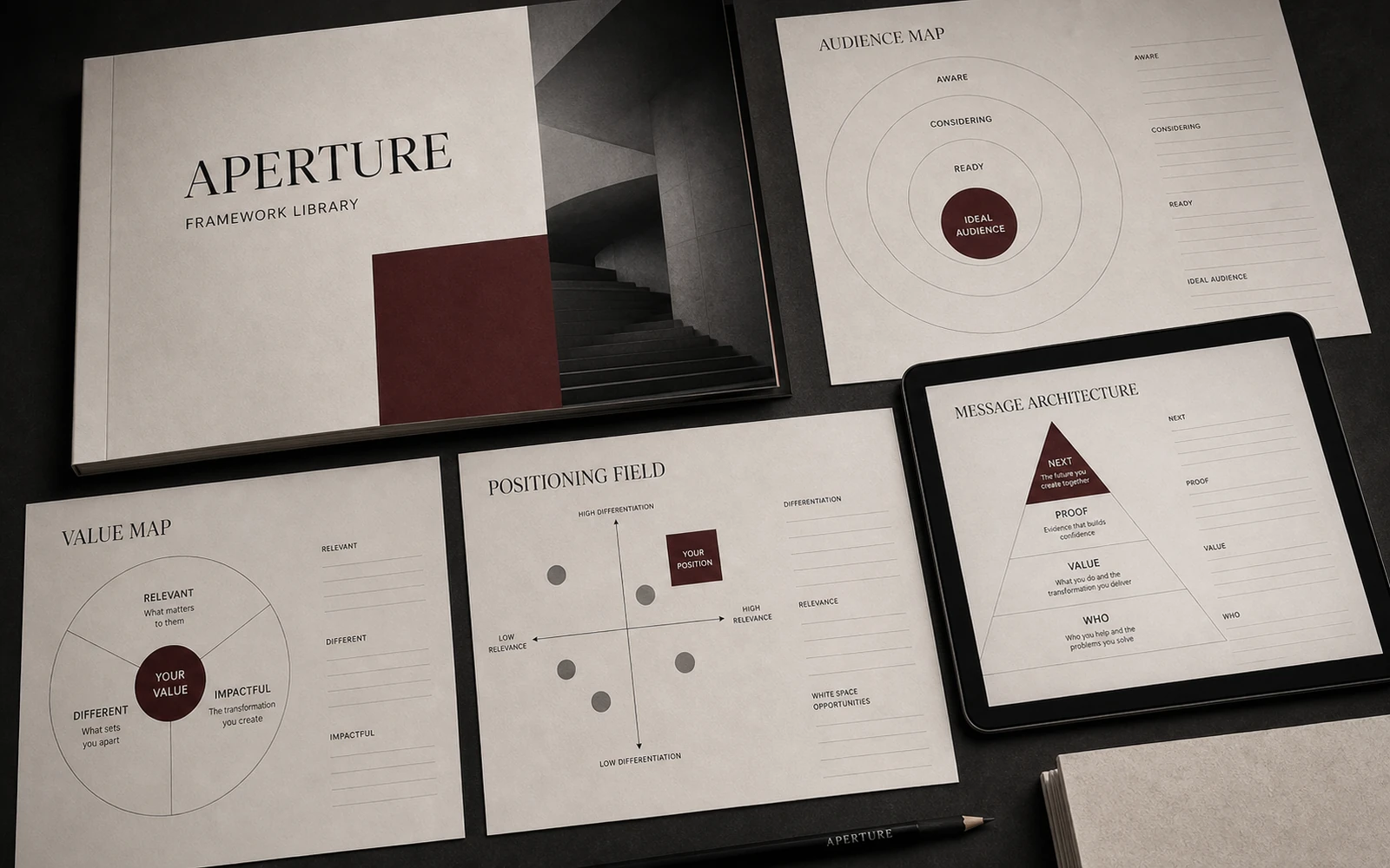
The approved workbook included modules with very different densities: theory, diagnostic prompts, worked examples and writing space. We designed a distinct layout and set of visual cues for each existing content type. Audience portraits, value maps, competitive fields and messaging architecture remain the author’s strategic tools, but now belong to the same legible editorial system.
The eighteen frameworks supplied by the creator were translated into a shared geometric language. The design does not alter their logic; it separates the premise, model, example and application area so the relationships can be understood at a glance. That consistency also makes each framework easier to adapt for a lesson slide or webinar without redrawing the method from scratch.
Understand
Apply
Learning experience
From analysis to positioning, without losing the thread between lessons.
The established course sequence moves from principle to model, example and application. Design gives each of those moments a recognisable signal, so theory does not blur into observation and a decision does not disappear inside a paragraph. Participants can return after a video or consultation and immediately find the page, framework or field they need.
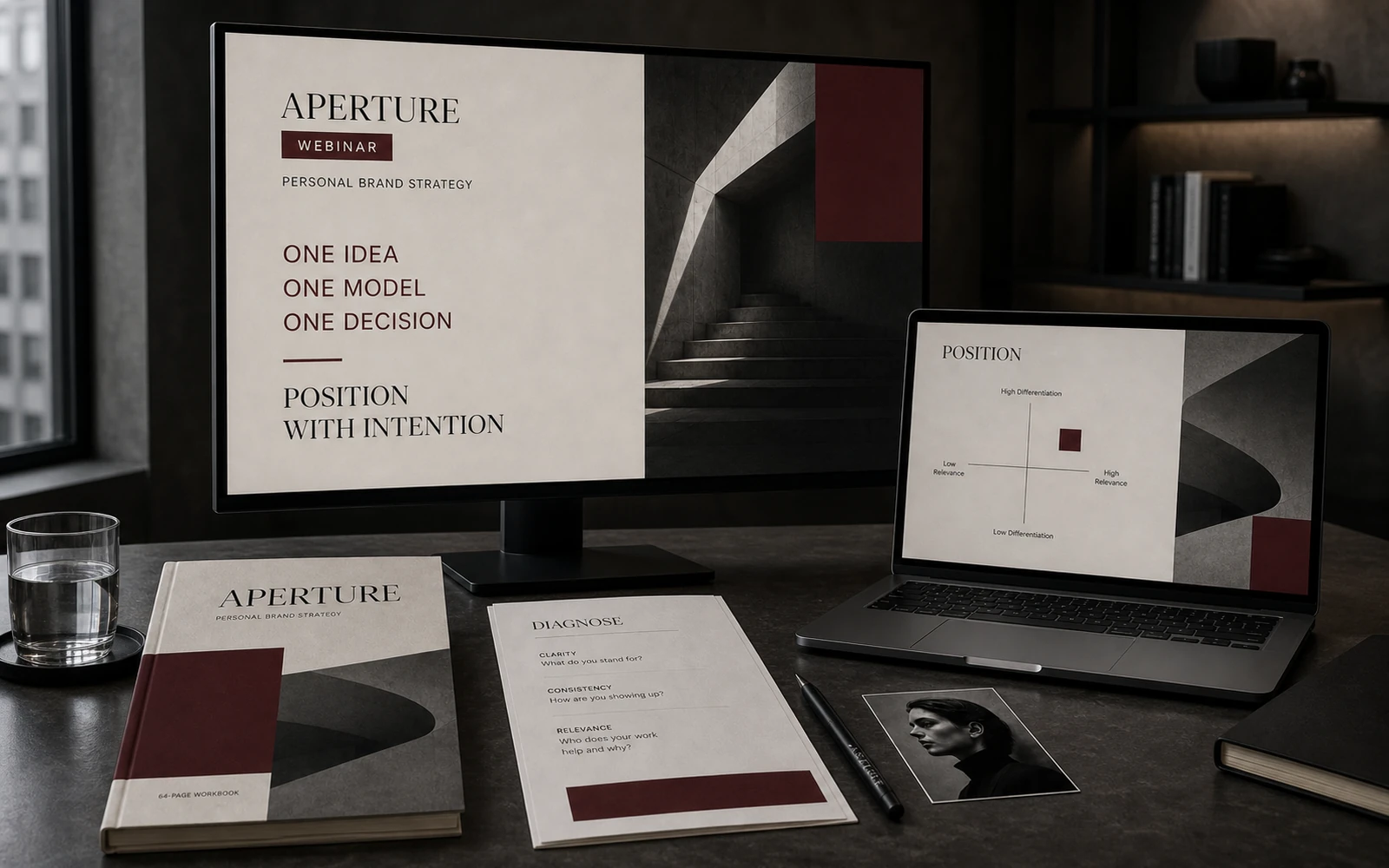
The slide library follows the same logic without projecting the workbook onto a screen. A slide holds one idea, one model or one example; the detailed work stays on the page. The instructor gains a clear visual support for teaching, while participants can connect what they hear with what they record. New course materials can use the established layouts without inventing another style.
Launch system
The campaign reveals the character of the course before the first lesson.
The webinar deck, social launch suite, Stories, banners and advertising share the workbook’s grid, typographic contrast and principle of focus. The campaign does not create a louder identity simply to sell. It offers credible glimpses of the actual experience: strategic questions, fragments of frameworks, editorial spreads and the precise language participants will encounter after joining.
The system changes intensity across the launch. Early pieces establish the point of view, the middle of the campaign explains the approach and shows the tools, and later assets gather the offer with greater clarity. A vertical Story, square post, display ad and widescreen webinar remain recognisably one product rather than four unrelated design commissions.
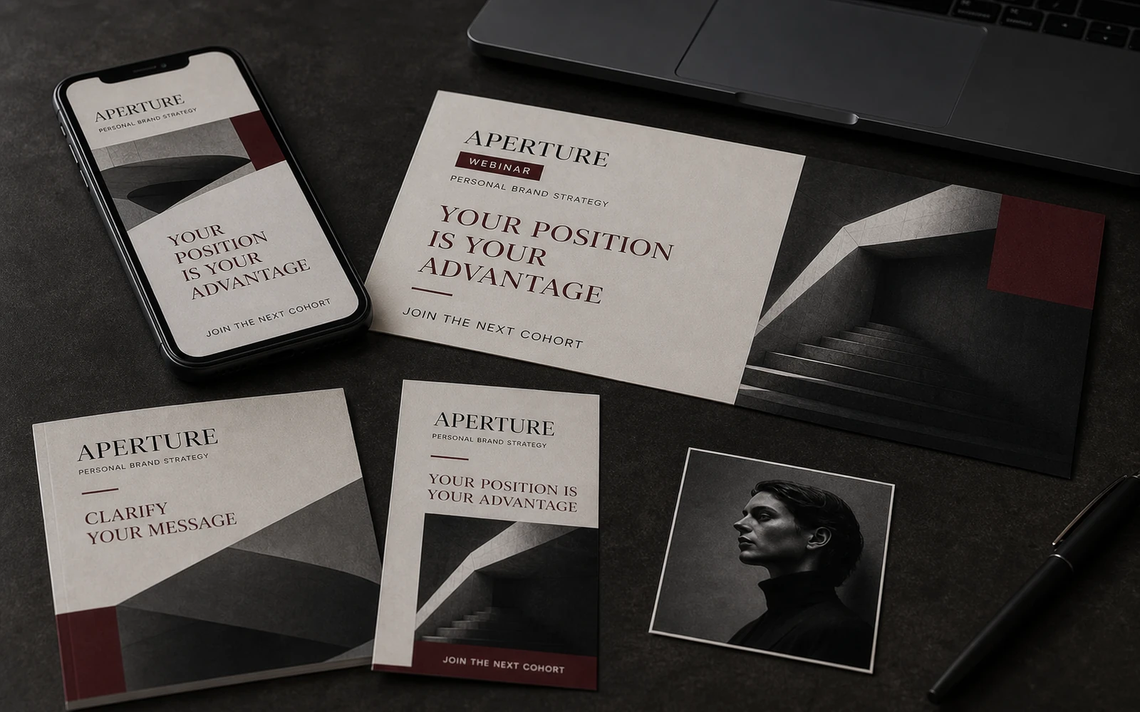
 Story 9:16
 Social 4:5
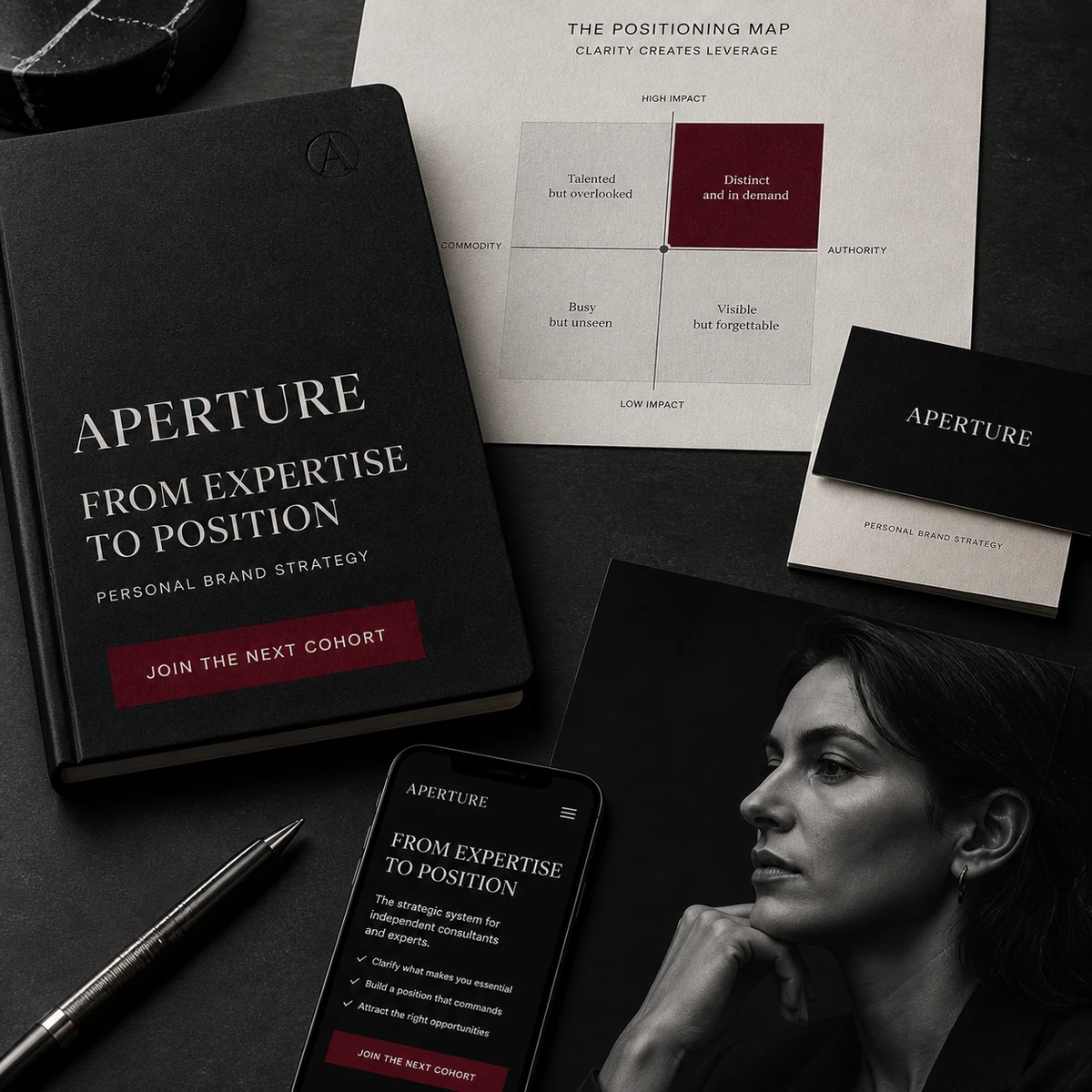 Campaign 1:1
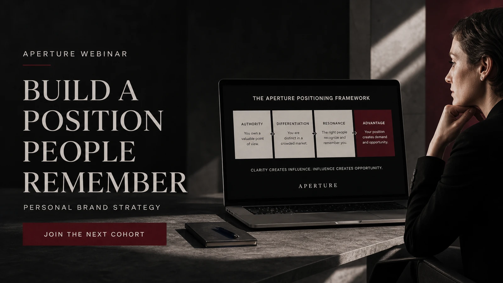 Webinar 16:9
System deliverables
64-page editorial workbook
18 strategic frameworks
Course slide library
Webinar presentation
Social launch suite
Campaign banners and ads
What the system enables
Aperture can expand without losing its editorial precision.
The result is not a single polished PDF but a visual language for both learning and launch. A 64-page workbook, eighteen frameworks, a slide library, webinar presentation and campaign suite are held together by consistent rules. Every format performs a different job without asking the audience to meet the product all over again.
The system is ready for future cohorts, updated examples and additional modules. The team has a clear visual treatment for theory, exercises, models, evidence and campaign messages. For the expert, that means a course brand that remains composed as it grows. For the participant, it means a clear route through complex strategic material.